1
One Idea Per Line:
A Guide to Making Easy
Read Resources
1

2
Table of Contents
Why Make Accessible Resources? ................................................ 5
What Does This Guide Do? ............................................................ 6
Part 1: Writing
Why Should I Write in Easy Read? ................................................ 7
What are the main things to know about Easy Read? ............... 8
How do I write in Easy Read? ...................................................... 10
Outline ............................................................................................... 10
Passive vs. Active Voice ................................................................... 11
Straightforward language and repetition ..................................... 12
Dene terms ..................................................................................... 13
Bulleted lists ..................................................................................... 13
Using examples ................................................................................ 15
Checking reading level ..................................................................... 17
Let’s try it out! ................................................................................... 19
Translating Documents into Easy Read .................................... 20
Starting from the original document ............................................. 20
Dening words ................................................................................. 21
Make sure Easy Read has the same information ......................... 22

3
Summarizing ..................................................................................... 23
Plain Language ............................................................................. 24
Focus Groups ................................................................................ 26
Easy Read FAQs ............................................................................ 31
What happens when adding background information
makes the Easy Read document too long? ................................... 31
Can everything be written in Easy Read? ...................................... 32
What if I can’t write/format in Easy Read? .................................... 32
What if my organization doesn’t have the time/money
to write in Easy Read? ...................................................................... 33
What if our target audience doesn’t like or won’t read
work in Easy Read?........................................................................... 34
To learn more: .............................................................................. 34
Part 2: Formatting
Easy Read Visual Style ................................................................. 35
Text size & san serif font ................................................................. 36
Spacing ............................................................................................. 37
Paragraphs per page ....................................................................... 38
Changing topics ................................................................................ 39
Multiple Parts ................................................................................... 39

4
Glossaries .......................................................................................... 40
Basic text formatting .................................................................. 42
Left aligning text ............................................................................... 42
Turn o hyphenation ....................................................................... 44
Runts, widows, and orphans .......................................................... 46
Icons .............................................................................................. 48
Guidelines ......................................................................................... 48
House Rules ...................................................................................... 53
The Icon Process .............................................................................. 54
Saving time with styles ............................................................... 62
ASAN’s Style Library ......................................................................... 63
To learn more: .............................................................................. 65

5
Why Make Accessible Resources?
If you make toolkits, factsheets, or other kinds of written resources,
you should make your resources accessible to people with all kinds
of disabilities. Access is a civil right, and everyone deserves access to
information. You may have already heard about some ways to make
information accessible—like Braille, audiobooks, sign language videos,
or screenreader-accessible formatting. This guide will talk about Easy
Read, which is a format designed to make information accessible to
people with intellectual and developmental disabilities (IDD).
At ASAN, Easy Read is the best way we have found so far to make
complicated information accessible to people with IDD. That’s why it
is so important. Don’t think of Easy Read and other accessible formats
as “add-ons” to the “main” resource, or as “extras” to add if you have
the time. When you make information accessible, you are including
people—when you don’t, you are excluding. We want to give you the
tools you need to include more people!

6
What Does This Guide Do?
This guide will teach you how to write in Easy Read. Easy Read is a
style of writing that uses clear and easy-to-understand language. Each
sentence in an Easy Read document is shown next to a picture icon to
illustrate the information in that sentence. This helps people who are
visual learners to better understand the content.
There is a long history of self-advocates creating more accessible ways
to share information. Easy Read is part of that history. Easy Read has
been used in New Zealand, Australia, and the United Kingdom for
longer than it has been used in the United States. But by now, many
organizations in the U.S. and internationally have done Easy Read
work. In the U.S., some organizations that have done a lot of work in
Easy Read are Self Advocates Becoming Empowered (SABE) and Green
Mountain Self Advocates (GMSA). ASAN has been lucky to work with
both of these organizations on some of our Easy Read resources.
At ASAN, we have been making Easy Read resources since 2016. We
have learned a lot over the last 5 years. We have worked closely with
people with intellectual disabilities to make our Easy Read words and
icons easier to understand. We have developed standards for how
to make Easy Read resources the way we do. This guide explains and
shares those standards. We hope by showing you how we do our Easy
Read work, you can start writing in Easy Read for your own work.
People write in Easy Read in many dierent ways. For example, the
standards used for Easy Read in New Zealand may not be exactly like
the guide we are writing. This guide doesn’t explain “one right way” to
write in Easy Read—it just explains the current standards that ASAN
uses. Future versions of this guide may have dierent information. Since
2016, we have been working to make our Easy Read better, and we still
make changes to how we do Easy Read when things need to improve.

7
Part 1: Writing
Why Should I Write in Easy Read?
Making resources in Easy Read should be an important part of
any organization’s work. Easy Read was originally created to
make documents more accessible for people with intellectual and
developmental disabilities (IDD). But there are lots of dierent groups
that may have trouble reading documents at a high reading level. For
example, people who speak English as their second language, people
with language processing disabilities, or older adults who may have
trouble seeing or understanding information, may struggle to read
inaccessible resources.
Many of these documents have information that is crucial to making
decisions about their lives. These can be government documents, policy
documents from nonprot organizations, or even information about
community resources. Now, government agencies and some companies
are learning how important this is.
Easy Read shows information in two ways - with pictures and words -
and repeats the main ideas of the document to make sure the most
important information gets understood. Writing in Easy Read helps
create a more equitable society. It makes sure everyone can access the
same information.

8
What are the main things to know about Easy
Read?
The most important thing to know about Easy Read is that it can
be done! It may seem like the topics you want to write about are so
complex that Easy Read would be impossible. You might have to think
about your topic in a dierent way, but you should always go into an
Easy Read project assuming you can do it.
Another important thing to know about Easy Read is that you should
include all the same information in an Easy Read resource as you would
in a non-Easy Read resource. An Easy Read resource should give the
reader all the information, just explained in a dierent way. If you are
writing about the federal budget in Easy Read, you still need to explain
committees, discretionary vs. non-discretionary spending, and what
“appropriations” means. In fact, it’s even more important that you do a
good job explaining these things in an accessible way.
When you write in Easy Read, you might have to give more background
information about a topic. Many people who could use Easy Read
documents may not have been given clear information on topics that
others assume they already know. As a result, writing in Easy Read
requires a dierent process than writing in other styles. When writing
in Easy Read, you might need to “go back” and break down concepts
before you can explain your main idea. For example, to write in Easy
Read about Medicaid, you might have to start by explaining what health
insurance is. You might also talk about what kinds of health insurance
exist, or how the government pays for Medicaid.

9
While it may seem like the process of Easy Read makes things more
“simple”, it is really dicult! It takes a lot of examining what you already
know, and guring out how to make that knowledge accessible. Think
about your writing from the reader’s point of view. For every sentence,
paragraph or idea, ask “so what?” and “how does this aect me?”
Make sure that your writing answers those questions, and doesn’t have
information that isn’t important to the reader.

10
How do I write in Easy Read?
Outline
The rst step for your Easy Read project, as with many kinds of projects,
is to create an outline. This is the chance to gure out your main idea.
It also helps you nd places you may need to expand your content to
esh out your main idea. Again, remember that your audience may be
coming in with little to no knowledge of your topic. Include background
information that is relevant to your main subject, even if it may not
come up again in the document. That makes sure everyone is coming
into the core of the document with the same prior knowledge.
When outlining, think about how you will split your content into
sections. Having smaller sections that readers can choose within a larger
document helps reinforce main ideas. It also makes the amount of
content less overwhelming. It may be helpful to frame each section and
sub-section as questions that you hope to answer within your writing.
For example, let’s say you’re writing a document on housing policy, and
you have a section on aordable housing. Here is what one part of that
outline might look like:
What is aordable housing?
• What does “aordable” mean?
• Who makes aordable housing?
• Who can get aordable housing?

11
Once you have an outline, it’s time to start writing! Here are tips to help
you write in an accessible way:
Use short sentences - about 10-15 words per sentence is best. Each
sentence should not take up more than a line in a standard Word
document in most 12-point font. Try and stick to common words, unless
you need to include terms specic to your main idea/topic. In addition,
try to stick to one idea per sentence. Having more than one idea per
sentence can make the sentence less clear, so in most cases, it is best to
split it into two sentences.
For example:
Original text:
Our fellowship program will involve working with a mentor to
develop skills through a year-long project.
Reworded text:
Fellows work with a mentor.
They work on a project together for one year.
This helps our fellows learn new skills.
Passive vs. Active Voice
You also want to avoid using passive voice in your Easy Read writing.
“Passive voice” means that instead of there being a subject doing an
action in the sentence, the subject is just receiving the action being
done by someone or something else. Active voice is much better for
accessibility, because it is clearer and more direct.

12
Active voice: You want to avoid using passive voice in your writing.
Passive voice: When writing, passive voice should be avoided.
Straightforward language and repetition
Another important part of writing in Easy Read is using straightforward
language and repetition. Watch out for using words like “this,” “they,” or
“it” when it might not be clear what or who you’re talking about. In these
instances, it is better to say the subject again, or divide the sentence into
two sentences.
People with IDD may not always understand metaphor, sarcasm, or
other gures of speech. Avoiding these ways of speaking can make any
document more accessible. This doesn’t mean you can’t use any gures
of speech in your Easy Read documents! If you do use them, just clarify
what the gure of speech means. For example:
Original text:
The brain of someone with ADHD is like a wild horse.
Reworded text:
People with ADHD sometimes feel like their brain is “hard to steer.”
They feel like using their brain is like riding a wild horse.

13
Repeating the main ideas of your paper throughout the document is
also helpful for writing in Easy Read. These reminders can help readers
better connect to dierent chapters/sections of your document. They
also give a clear message that is more likely to be remembered once
someone nishes reading the document. Remember, “going backwards”
by reinforcing these ideas can help you move forward in the Easy Read
process!
Define terms
For terms specic to the topic of your document, dene each term using
accessible language. For example, in the Medicaid document mentioned
earlier, Medicaid would need to be a term that is dened. Each dened
word should appear in bold the rst time it is dened. You should also
put all denitions in a glossary. We usually call this section “Words to
Know”, and put this list at the front of our Easy Read documents. This
lets people read the denitions before starting the main paper, and
gives people an easy space to look back to. For the most important
terms, use repetition within the document to remind readers of these
denitions.
Bulleted lists
Some people who write in Easy Read use bulleted lists to organize
ideas. ASAN uses these because it makes more separation between
ideas. It also gives more space and uses more pictures to help readers
understand. Other people who write in Easy Read try not to use bulleted
lists. They think having lists that are too long makes the document less
accessible.

14
ASAN usually does not use numbered lists for this reason. Readers may
forget what number they are on within the list, which can accidentally
make the document less accessible. Try to only use numbered lists
when talking about a specic sequence of events.
Overall, we have found bulleted lists to be more helpful than harmful.
This may depend on individual documents or preference, so try them
out and see what works best for you.
For example:
Original text:
Some examples of public places are a hair salon, a restaurant, or a
movie theater.
Reworded text:
Some examples of public places are:
• A hair salon
• A restaurant
• A movie theater
People who avoid bulleted lists in their Easy Read would rewrite the
example like this:
A hair salon is a public place.
A restaurant is a public place.
A movie theater is a public place.

15
Using examples
Using many examples is also common in Easy Read. Examples help
readers to better understand the content by “walking in someone else’s
shoes”. It makes ideas more concrete instead of abstract. For example,
if you write about housing insecurity, but the readers of the document
may not have all experienced housing insecurity, writing about this topic
in the second-person point of view could cause confusion. Writing in the
third-person xes this problem.
For example:
Original text:
If you were experiencing housing insecurity, you might try and call
the local shelter, but they might not have a bed for you.
Reworded text:
Jim is dealing with housing insecurity.
He does not know where he can sleep tonight.
He tried to call the local shelter.
But the shelter did not have a bed for him.
This example assumes that “housing insecurity” was dened earlier in
this document. It also helps remind readers of what “housing insecurity”
means by adding that Jim does not know where he can sleep. Using
a third-person example instead of a second or rst-person example
makes things more clear in this case.

16
Breaking up examples
One thing to be careful of with examples is that they can become
too long. Readers might forget parts of the example story before it is
nished. In this case, it can be helpful to create 2 hypothetical people
to compare dierent scenarios. Or, you could add short sections in
between examples to break up the ideas.
Reading level
Lastly, the most common part that gets talked about in Easy Read is
reading level. Reading level is very important, but as you now know, it
isn’t the only thing you should think about when writing in Easy Read!
To make Easy Read as accessible as possible, ASAN aims to write our
documents between a 3
rd
and 5
th
grade reading level. Reading level
is gured out in a variety of ways, including some that we mentioned
earlier, like sentence length and word complexity.
To start lowering the reading level of your work, try to avoid using
longer words where simpler ones will do. Instead of saying a task is
“laborious,” you could say it is hard or dicult. Use http://thesaurus.
com/ to nd simpler synonyms for longer words. You can also look up
complex topics using the Simple English Wikipedia pages.
You can practice re-writing ideas in simpler language by testing your
writing here: http://splasho.com/upgoer5/. This page will challenge you
to use only the 1,000 most common words in your writing.

17
Checking reading level
There are lots of websites that can check the reading level of a
document. The most commonly-used ones are called Hemingway,
Readable, and Automatic Readability Checker. All of them check reading
level using a group of scales. These scales can show a wide range of
reading level scores for the same content.
It is generally easiest to take the average of all of these scores as
your overall reading level. However, you should also go through
the document and check places that the websites ag as being less
accessible. Some of these ags may be for reasons that don’t matter.
For example, many readability checkers ag adverbs as being dicult
to understand, even though our readers have never had trouble with
them. Other times, these ags may be a good hint to shorten a sentence
or change a word.
Getting accurate scores
When putting your work through a reading level checker, you should
take out certain pre-dened words that would “throw o” the score. For
example, let’s say you are explaining the federal budget process, and
must include the term “budget resolution.” You dene the term the rst
time you use it. When checking the reading level, you could replace the
term “budget resolution” with a shorter placeholder word, so that the
phrase will not get agged every time.
You can also do this for words that your readers already know. For
example, let’s say you are writing in Easy Read for a group of people
with disabilities. You can choose not to dene the word “disability”, but
you can remove it from the reading level check.

18
The reason we take pre-dened words out when we do reading level
checks is not because we are trying to “cheat” the score. Flagging these
words every time won’t help us make the document better, because we
have to use those words no matter what. Replacing these words lets us
focus on everything we can still change to lower the reading level. But,
you should use this process to make sure that you’re only using jargon
or long words if you absolutely have to. Every time you remove a word
from a reading level check, think again about whether it really needs to
be in your resource, or if there are more accessible words you should
use instead.
The easiest way to change wording for a reading level is to use the “nd
and replace” function in a Word document to nd a word. Then, you
can go through every time that word is used, and put a simpler word
in its place. ASAN likes to use dierent common fruit names, but the
replacement words are up to you!
Reading level checkers usually let you enter as much text as you want
at once. We recommend that you start by checking no more than a few
paragraphs of your document at a time. Larger blocks of text can throw
o the overall readability score. This also makes it easier to highlight
specic sections that may need editing.

19
Let’s try it out!
Here are some sentences that are written using more complex
language. Try simplifying these and dening terms if needed. You can
also research something you enjoy or are working on. Take a sentence
from a book or article you’re reading, and try rewriting it.
Some people communicate in ways that are not verbal, such as
through pointing at pictures or typing on an iPad.
One dierence between part-time and full-time jobs is that full-time
jobs have to oer employees health insurance, while part-time jobs
do not.
When I met with a representative from the California Department
of Education, they told me about their plan to stop requiring certain
standardized tests.
Remember:
One sentence per line, one idea per sentence.
You may need to “go backwards” to move forward!
When you’re done, try comparing the readability level using the
Automatic Readability Checker. See how much lower you can get the
reading level without sacricing the content of your sentence.

20
Translating Documents into Easy Read
There are dierent ways to write an Easy Read document. Some people
choose to start from scratch and write in Easy Read, then make a more
complex version based on that document. Others write an original
document and then “translate” that document into Easy Read. Or,
someone may take a document that they have already published, and
then work to translate it. When translating into Easy Read, many of the
same things outlined above are important to keep in mind. But there
are also other things you need to pay attention to specically when
doing “translation” work.
Starting from the original document
The most important part of translating work into Easy Read is that the
content of your Easy Read document must have the same information
as your original document. For example, your organization may write a
document on housing policy. If you were to also write this document in
Easy Read, you must put all of the information in that original document
into the Easy Read document. There are times where this will be dicult
to do! You may have to change the order of ideas, the kind of language
you use, and other things about your writing. But helping people have
equitable access to information is the reason Easy Read was created.
The only way to do that is to make sure that Easy Read writing has all of
the same information as any other document.
Starting with a complex document means you’ll need to break it
down into smaller parts. You can start with making a new outline that
condenses the main ideas in your original document. This can help you
gure out if the order of your original document makes sense for Easy
Read, or if the framing needs to be changed.

21
Creating this outline can also help you ll in the information “gaps” that
you may have in your original document. You may need to esh out
concepts that were not fully explained in the non-Easy Read version
of your work. You will also need to break down longer sentences into
multiple shorter ones, which may aect the sequence of ideas.
You should also think about which terms in your original document
should be dened vs replaced. On the one hand, readers should be able
to understand words that they will come across often. On the other
hand, dening too many terms or putting in too much jargon can be
inaccessible.
Defining words
For words that show up often in the eld that you’re writing about,
it is usually best to dene them. For example, you might decide that
“aordable housing” is a commonly-used phrase in housing policy, so
you could dene it. On the other hand, a document on natural disasters
could rephrase a less-common term, like “emergency management,” to
something simpler. Someone could reword this phrase to say “dealing
with an emergency”. Then, they could dene what an emergency is in
the context of a natural disaster.
Note that even though “dealing with an emergency” is more words than
“emergency management”, the wording is more accessible. Keep this in
mind that in cases like these, shorter sentences are not always better.

22
Make sure Easy Read has the same information
As mentioned earlier, if both a technical/complex version of your
document and an Easy Read version will be available to the public, they
must have the same information in them. We try to release all versions
of a document publicly at the same time to make sure they are uniform.
You may have to compare a few drafts of the Easy Read and non-Easy
Read texts to make sure the Easy Read version has all the information
it needs. If you have already released a document publicly and want
to create an Easy Read version, do not remove any content that was in
the original document. It is okay to add in content in order to explain
concepts that were left out of the original, but removing content is not
giving Easy Read readers equal access.
If you are translating a document that you haven’t released yet, and you
feel like you need to take out content in order to make it accessible,
that is okay, as long as you remove the content from both versions of
the document. Remember, both versions have to include the same
information. But think very carefully about what content to keep
in, and what to take out. Asking your reader to learn too much new
information all at once can be inaccessible. But you should keep in the
important points that your reader needs to know to understand the
topic. For example, let’s say you are translating a resource about how
dogs evolved, which you haven’t published yet. If there is a long section
comparing dogs to cats, you might decide that people don’t need that
information to understand dog evolution, and cut it from both versions
of the resource. But you should leave in the section about how dogs
developed from wolves by living with people for thousands of years.
People need to know about that to understand dog evolution.

23
Summarizing
As a last resort, organizations without the resources to translate their
documents into Easy Read could write an Easy Read summary. This
means cutting down the content of your document to a paragraph or
two. This is similar to an abstract in other papers, but put into Easy Read
format. We want to emphasize that writing an Easy Read summary is not
equal access. While it is better than not writing in Easy Read at all, it is
just a starting point to creating accessible content.

24
Plain Language
You may have also heard of another way of making dierent documents
more accessible, called Plain Language. In comparison to Easy Read,
Plain Language does not have pictures, and is usually written between
a 6th and 8th grade reading level. It is important to make documents in
both Plain Language and Easy Read. The spacing, sentence structure,
and images in Easy Read documents may be inaccessible to certain
people. For example, some people have a hard time processing images,
or focusing on writing that is very “spaced out,” like in Easy Read. But
people who can’t use Easy Read for those reasons can still benet from
resources with less complex language, like Plain Language resources.
Fortunately, creating a Plain Language version of an Easy Read
document is pretty straightforward. Once you nalize the Easy
Read version, take another look through the text. Find places to
combine sentences and paragraphs. Since Easy Read only allows for
one sentence per line, shorter sentences can be put together with
conjunctions in Plain Language. Sections can be spaced together into
paragraphs, and you can change grammar or syntax to make the Plain
Language version ow better. Just avoid adding any more terms that
would need to be dened.
Plain Language documents should use at least 14pt text in a clear, easy-
to-read font. We use Open Sans for Plain Language documents. There
should still be plenty of space, though not nearly as much space as in
an Easy Read document. We use text with a 23pt leading (the space
between lines). Make sure to keep paragraphs together on the same
page, rather than breaking across pages.

25
Here is a quick example of Easy Read vs Plain Language:
Easy Read version:
Jack was a farmer.
He lived with his wife and children.
One day, someone stole Jack’s family’s cow.
The children got upset that their cow got stolen.
Plain Language version:
Jack was a farmer who lived with his wife and children. One day,
someone stole their cow, which made the children upset.
It is up to your organization whether you want to release a document
in Easy Read, Plain Language, a more complex version, or in all 3 ways.
ASAN tries to release most of our documents in bothin Easy Read
and Plain Language. We will sometimes write a technical document
if the topic is important for a certain group to know about, such as
researchers. If you do choose to release a document in all 3 ways,
it is also up to you to decide if you want your original document to
be written in Easy Read, Plain Language, or technical language. Each
of these choices has pros and cons in terms of how easy it will be to
“translate” between them. Which works best for you depends on your
own thinking style.

26
Focus Groups
The last part of the Easy Read project process is holding a focus group
to review the document. An Easy Read focus group should be made
up of people with intellectual disabilities. The focus group should
give participants an opportunity to give feedback on your Easy Read
document—and directly edit it to make it more accessible—before it is
published. A motto in the IDD community is “Nothing about us, without
us!”. This applies to writing in Easy Read, too. You have to meaningfully
add the voices of people with IDD in your work. By doing so, not only will
the nished project be better, but you’ll also have gotter feedback you
can use to make your next project better.
ASAN has written toolkits on running accessible meetings or focus
groups for people with IDD. You can nd those resources at https://
autisticadvocacy.org/resources/accessibility/. However, here are some
specic things to think about when running an Easy Read review focus
group.
Think about how you will recruit participants. Some places you can nd
people with IDD to work with you are:
People First Chapters - Self-advocacy groups for people with IDD.
There are groups all over the U.S. You can nd a list at https://www.
peoplerst.org/usa/
ASAN aliate groups - local organizations run by and for autistic
people.

27
Your state’s Protection and Advocacy (P&A) organization - P&As
help people with disabilities ght for our rights, and make sure states
follow disability laws. There is a P&A in every state. You can nd the
P&A in your state by going to https://www.ndrn.org/about/ndrn-
member-agencies/
Your state’s Developmental Disabilities (DD) Council - DD councils
work to gure out problems that the state can x to help people
with DD. Every DD council has to have people with developmental
disabilities on it. You can nd the DD council in your state by going to
https://www.nacdd.org/councils/
Your local Center for Independent Living (CIL) - These centers help
people with disabilities live in the community. You can nd a list of
CILs by going to https://www.ilru.org/projects/cil-net/cil-center-and-
association-directory.
Preparing for your focus group
Have at least 2 facilitators for the group, and try to include at least one
facilitator from the organization that helped you recruit (for example,
a self-advocate leader from your local People First chapter). It can be
dicult or embarrassing to say when you don’t understand something,
especially in front of strangers! Having a leader from within the group
as a co-facilitator can help participants feel more comfortable giving
honest feedback. We try to have facilitators with intellectual disabilities
as often as possible. You can also build relationships with these groups
by working on more projects together.

28
Provide the Easy Read document as a printout to focus group
participants a week or two in advance of the group meeting. This gives
participants a chance to look over it before the meeting and note any
initial impressions. They should bring this copy with them to the focus
group to follow along with.
Use a large screen or projector to show a version of the Easy Read
document to those within the focus group. While one person facilitates,
the other person can make edits to the projected document in real-time.
This lets focus group members see their edits and compare the rst
draft (their printouts) with the current draft.
The general ow of an Easy Read focus group is going line-by-line
through each section of the document. Then, the group has a chance
to give feedback on each line as a group and check for comprehension.
You can use this list of guiding questions to help direct critique about
the document. You can also project these questions on a screen or
whiteboard so participants can think about them.
• Does this make sense to you?
• Does the picture help you understand the words?
• Are we saying the ideas in the right order?
• Is there too much information? Not enough information?
• Would you change anything to make this better?

29
At the end of each section or page (depending on length), ask
participants to discuss what the section was about, and which
parts were important. You can also ask specic questions to check
comprehension. (“What parts don’t make sense?” “Does the toolkit
explain this well enough that you would feel comfortable teaching it
to someone else?” “Just to make sure we’re all on the same page, can
someone recap what the dierence between a primary election and a
general election is?”)
Remember, people with disabilities are the experts on our own
experience. There may be concepts that are confusing for your focus
group members, or the focus group process may take a lot of eort.
However, that does not mean you should treat focus group participants
in a condescending way. People with intellectual disabilities deal with
stereotypes and condescending people every day. Society thinks about
people with intellectual disabilities in a condescending way, so you
might act that way to people with intellectual disabilities without even
realizing it! Make extra eort to be humble and learn from focus group
participants as experts.The purpose of focus groups is for facilitators
and participants to learn from each other.That is how we all get better
at this work, and can only happen if you view people with IDD as your
equals.
Lastly, give credit where credit is due! Ask focus group participants if
they would like to be acknowledged within the document. You should
also pay focus group participants for their time. Members of advisory
boards, such as these kinds of focus groups, are experts in their eld.
They should get paid fairly to show that.

30
At ASAN, the members of our focus group are the editors of the
resource they are reviewing. When we credit them in the resource, we
list their names under the heading “Focus Group Editors.” We do this
to make it clear how important the focus group is in our process. The
editor of a book gets to make changes to the book—and the book isn’t
done until they say it’s good enough. It’s the same with our focus group
editors and the resources they review.

31
Easy Read FAQs
What happens when adding background
information makes the Easy Read document too
long?
Sometimes you might need to add a lot of background information in a
document. There might be so much information that it would be its own
separate Easy Read project. This is a common problem! When writing
in Easy Read, you have to try and balance out dierent accessibility
needs. On the one hand, re-dening important concepts can make
documents less confusing. On the other hand, it’s also important that
each document can be read as a standalone paper.
One way to do this is to link to other Easy Read documents within a
dierent document. For example, in an Easy Read document about
racism in healthcare, you could link to an Easy Read document you
published earlier. This document could dene, and give context about,
racism and discrimination. You can also make a summary sheet with the
most important denitions and concepts from past documents. You can
attach that to your current document, in the same way that you would
have a glossary. If you can, try using creative ways to link dierent Easy
Read documents together, such as through interactive websites.
In the end, while Easy Read helps make things more accessible for many
people, it will still be dicult for many people to access. Decisions about
what information to add, how and where to add it, and what words to
use can change based on the topic and your audience. Be creative, and
listen to the voices of the community members who need accessible
information.

32
Can everything be written in Easy Read?
We are trying to create a world where everything can be written in Easy
Read, but we are still guring out how. For example, this resource is
written in plain language, but not in Easy Read. We weren’t sure that we
would be able to explain everything in this guide in Easy Read. Like we
said earlier, we are still learning and growing our Easy Read work every
year. We’ve used Easy Read to write about a lot of complex subjects,
with dierent levels of success. Remember that even if you write an
Easy Read resource that doesn’t come out as well as you’d like, it is still
a good learning experience for next time. And you are taking important
steps to include more people in the work that you do!
It is especially important that you keep writing documents in Easy Read,
even if you put out work that isn’t the best at rst. People may be angry
if you try to write in Easy Read, but still end up with inaccessible content.
The fact that your organization is getting critique shows how important
it is to write in Easy Read. It means that your community wants you to
keep trying and do better! Easy Read is a skill, and you will develop it
over time.
What if I can’t write/format in Easy Read?
Before deciding you can’t write or format in Easy Read, try practicing
rst. It can take a while to get the idea. Try doing some of the exercises
listed above with dierent topics. It can be helpful to take breaks and
come back and try more later as well. Give yourself more time than you
think you’ll need, especially for your rst Easy Read projects. You could
also ask someone to teach you, or work in a team to brainstorm and
revise documents if you get stuck by yourself.

33
If you’ve practiced a lot and still can’t make Easy Read work for you,
that is okay! Everybody’s brain works dierently. Some people may
have disabilities that keep them from writing in Easy Read or thinking
visually. For others, Easy Read may just not be a skill they can pick up.
You may need to reassign Easy Read work to someone else in your
organization. For example, ASAN generally has one person write Easy
Read documents, while someone else formats them. That’s because
these two skill sets are very dierent from each other. Many people with
disabilities are great at writing in Easy Read because we nd this format
most accessible to us. Your organization could also hire someone with a
disability to do Easy Read work or oer advice.
What if my organization doesn’t have the time/
money to write in Easy Read?
Does your organization have the time and money to write for a general
audience? People who need Easy Read are a part of that audience.
Writing in Easy Read shows that you care about communities that may
need this kind of resource, such as people with disabilities and English
language learners.
At the same time, we know it can be dicult to nd funding to write in
Easy Read. ASAN encourages other organizations to join our eorts to
get this funding! Propose the idea to funders to set aside grant money
specically to make Easy Read documents. You can also build in the cost
to create an Easy Read resource alongside a grant proposal for a general
audience document.

34
What if our target audience doesn’t like or won’t
read work in Easy Read?
To be inclusive of all the members of our community, we need to make
Easy Read resources. This need should be respected regardless of
the opinions of those who won’t read these resources. In most cases,
releasing a Plain Language version of a document alongside the Easy
Read version works well for a general audience. Like we said earlier, you
can also release technical documents for groups like policy-makers or
researchers. Whichever versions you decide to write, continue to release
Easy Read resources!
To learn more:
A guide to making Easy Read information - from the Oce of Disability
Issues in New Zealand
Guide for Creating Cognitively Accessible Language - from Self
Advocates Becoming Empowered (SABE)
Plain Language Resources - from Self Advocates Becoming Empowered
(SABE)
https://www.plainlanguage.gov/guidelines/ - Ocial guidelines from the
U.S. government on plain language.
NOTE: some of these documents use the phrase “learning disabilities.”
This is a term for intellectual disabilities in the UK.

35
Part 2: Formatting
Easy Read Visual Style
Part 1 of this guide was all about how to make your text into Easy
Read text. The other half of the Easy Read process is formatting the
text so that it’s visually Easy Read. In this section, we’ll be explaining
how to format your text using Adobe InDesign and Adobe Bridge. This
section assumes a basic familiarity with InDesign and Bridge; if you’re
totally new to either one, check out the resources at the end for links to
introductory resources to get you started.
There will be a lot of mentions of specic sizes for fonts, spacing, and
images throughout this section—these are the specications that ASAN
uses in our Easy Read materials. You may nd that bigger text and more
white space works better! We’d recommend not adjusting the text or
spacing to be smaller than what we’ve laid out, however.
There are also less technical parts of this section that talk about how
to pick good images to accompany your text. The parts about choosing
icons don’t rely on any specic software or software knowledge.
36
Note: Throughout this section, we’ll be describing our Easy Read
formatting using pica measurements. If you use pixels, points, inches, or
another measurement system, you can use this converter to translate.
Text size & san serif font
Easy Read formatting is designed to make a document more accessible
to people with a variety of disabilities.
Large font sizes help make Easy Read resources more accessible to
people with visual impairments, dyslexia, and other disabilities. We use
sans-serif fonts for the same reason—serifs can make letter shapes
harder to recognize and parse. Learn more about selecting a good
typeface.
37
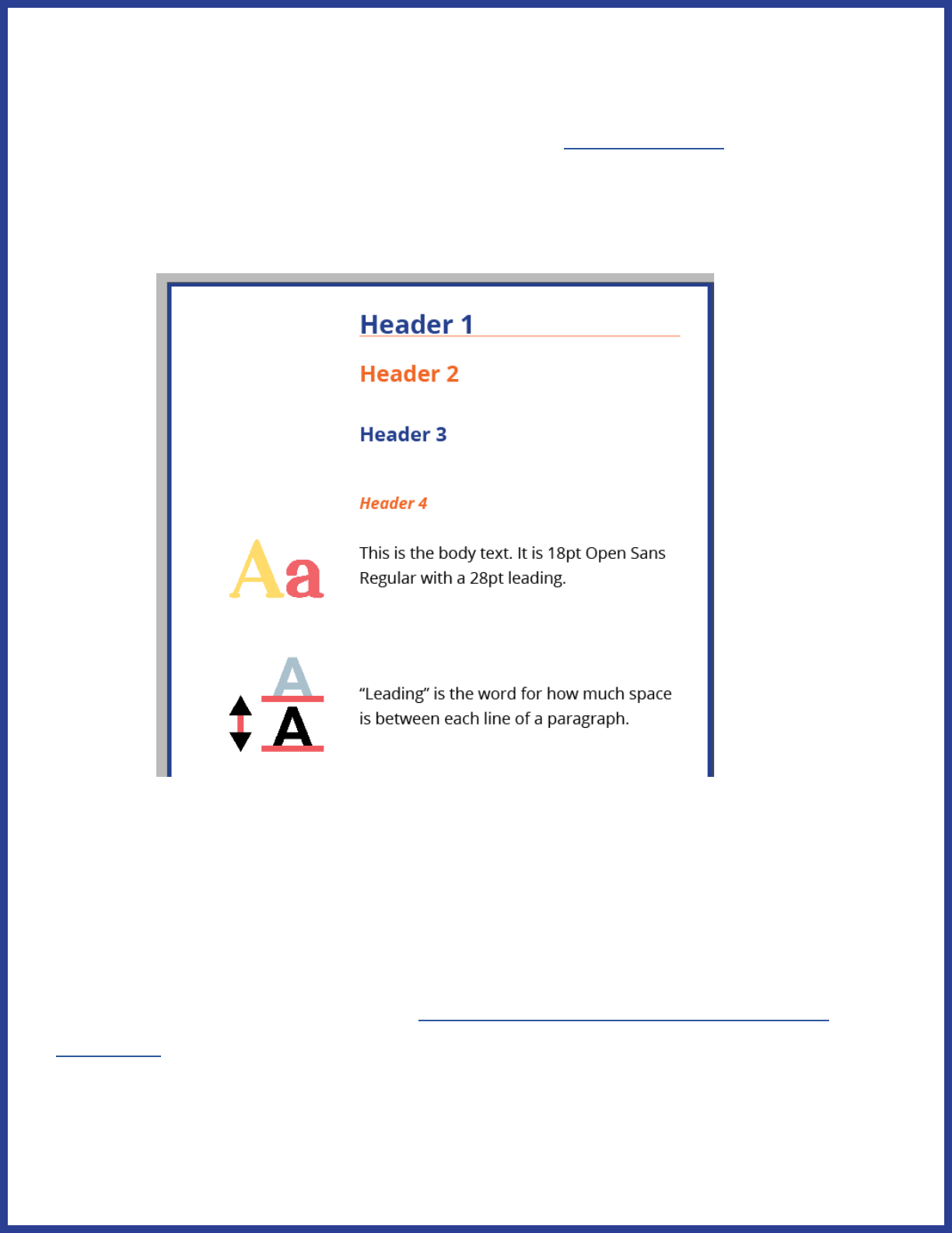
Here are the specications for our headings and text:
Heading 1: Open Sans Bold, 29pt; space before, 1p8; space after, 0p6
Heading 2: Open Sans Bold, 25pt; space before, 1p8; space after, 3p3
Heading 3: Open Sans Bold, 22pt; space before, 0p0; space after, 4p0
Heading 4: Open Sans Bold Italic, 18pt; space before, 0p0; space
after, 2p4
Body text: Open Sans Regular, 18pt; space before, 0p0; space after,
minimum of 5p8
Spacing
White space is crucial to accessible design. It helps to visually group
related content together as well as reduce visual clutter. You may have
heard people say it’s hard for them to read a “wall of text”, referring
to long blocks of text with inadequate spacing. For many people in
your audience, visual clutter and densely-packed pages are more than
annoyances; they’re barriers to access.
38
Here’s where to set space after in InDesign:
Our text boxes are 30p0 wide by 60p0 tall in most cases. There is a 1p0
gutter between the text box and the clipart column. Note that clipart
doesn’t have to touch the line; rather, that is the closest the edge of an
image can come to the text box. It is considerably more cramped if you
scrunch the images right up to the line:
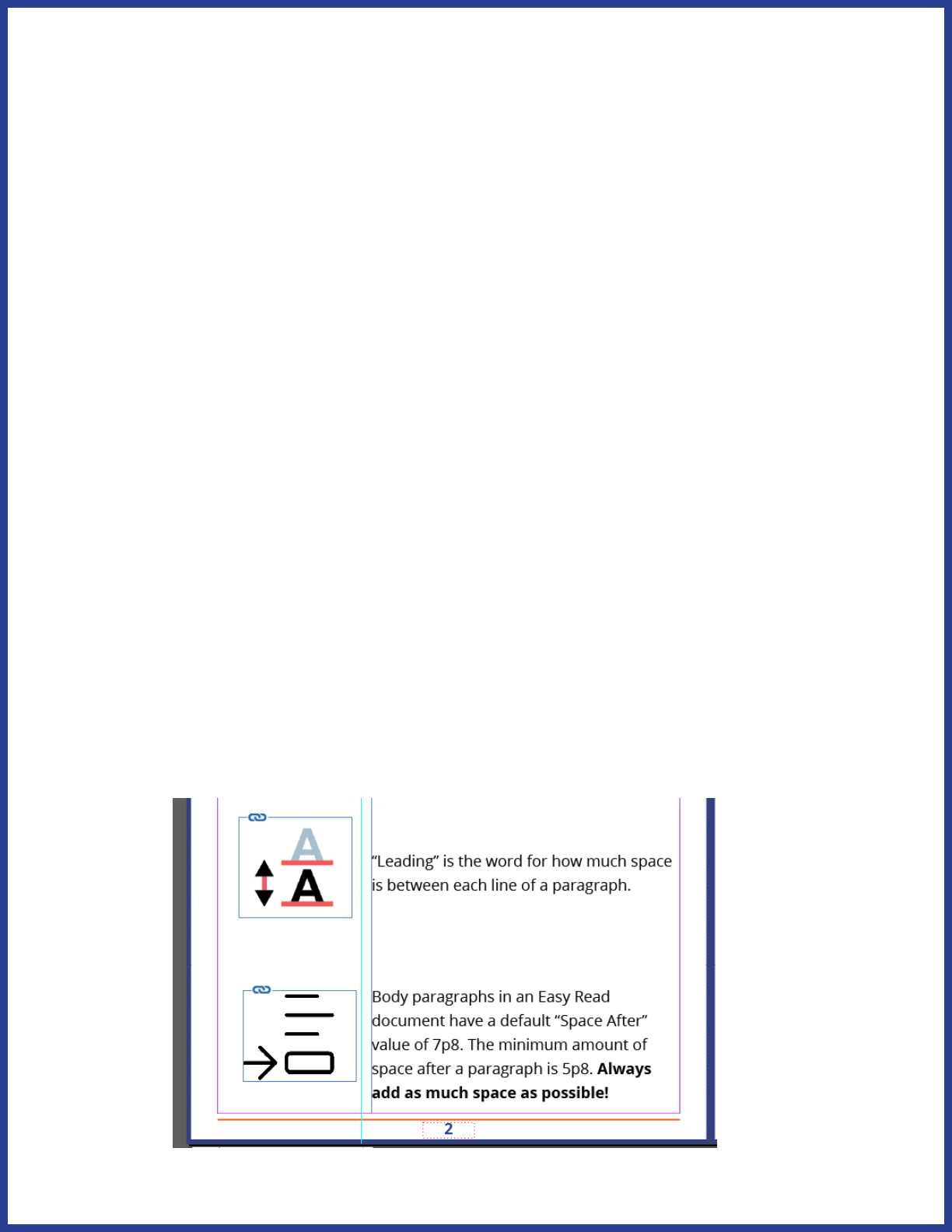
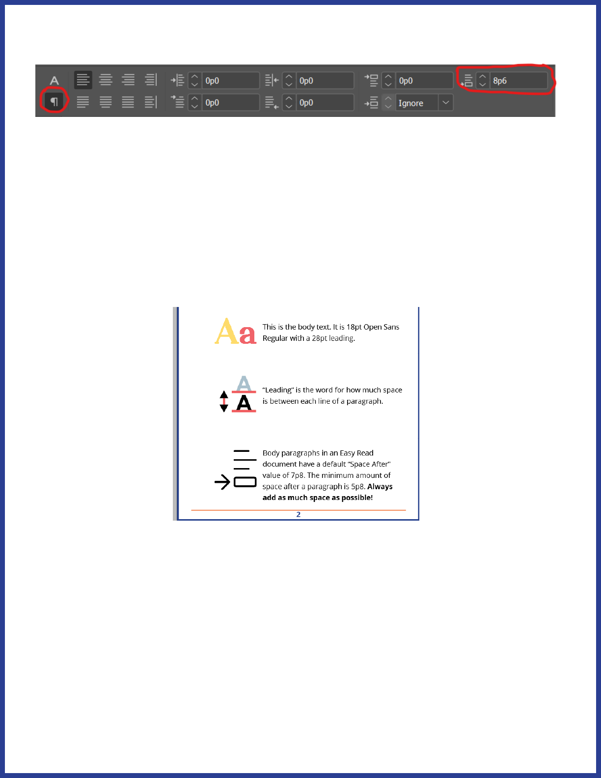
Paragraphs per page
It’s important to have a lot of white space between paragraphs (and
remember, in Easy Read, a paragraph is only one or two sentences,
usually one), both for the sake of avoiding a “wall of text” as well as
preventing clipart congestion. We use an absolute minimum of 5p8
space after each paragraph; the default is 7p8. However, any time you
nd you still have space available at the bottom of the page, consider
spacing out your paragraphs even more. You should always use “space
after” instead of hitting the enter key—trust me on this one.
39
In order to keep pages reasonably spaced, we have an absolute
maximum of 5 paragraphs per page. The only exception is for bulleted
lists, as the rst paragraph won’t have a clipart image.
Changing topics
Each topic should start on its own page, even if there’s plenty of space
at the bottom of the page for a previous topic. This helps keep the ideas
pertaining to a topic visually linked and makes it easier for the reader to
tell when a new topic is being discussed.
Multiple Parts
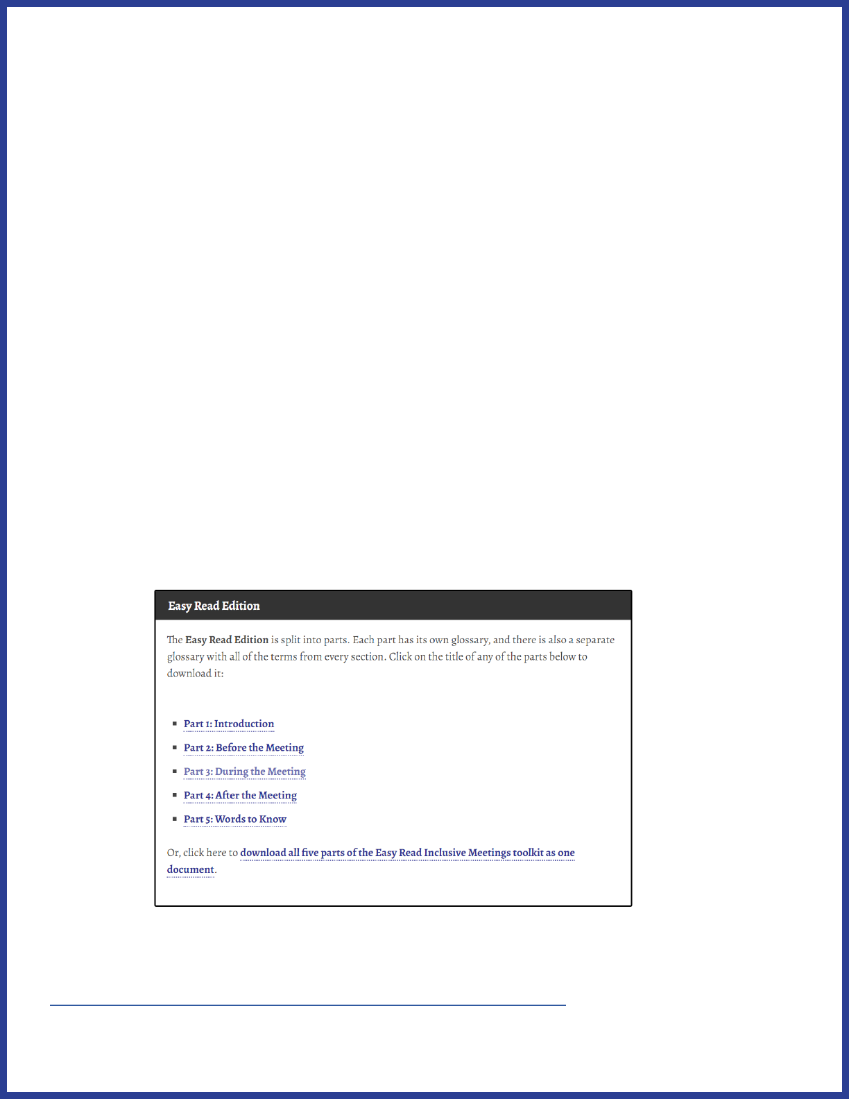
We divide our Easy Read publications into parts. Each part can stand
on its own, as a separate le with its own Words to Know section at the
beginning. This helps break up often unwieldy documents and makes it
easier for readers to jump right to the parts they want to read.
We use InDesign “book” les to keep multi-part documents in order.
Click here to learn about using InDesign book les.

40
Glossaries
Glossaries, which we call “Words to Know” sections, are always included
at the very beginning of each part, right after the title page. This helps
readers get acquainted with important terms before seeing them again
in context. The rst time a term from Words to Know is used in each
part of your document, the term should be bolded.
Icons
One important aspect of Words to Know entries is their use of icons.
The icon associated with a particular term will be used throughout the
document to refer to that term and form the basis of related terms, so
it’s important to pick a clear image. For example, here’s the Words to
Know entry for “managed care” and “Managed Care Organization”:

41
As you can see, the icon for Managed Care Organization already builds
upon the icon for “managed care”. Here are some more icons used
throughout the toolkit that build upon these terms:
check if the MCO is good
MCO helps people move into the community
state starts a new managed care program
We’ll talk more about choosing and creating good icons later.
Repetition
Because each part of an Easy Read document can stand alone, the
Words to Know sections must reect that. If a term appears in both
Part 1 and Part 2, it must also appear in both Words to Know sections.
This both ensures that a reader can start anywhere and still get the
necessary context, as well as serving to reinforce terms between
sections.
42
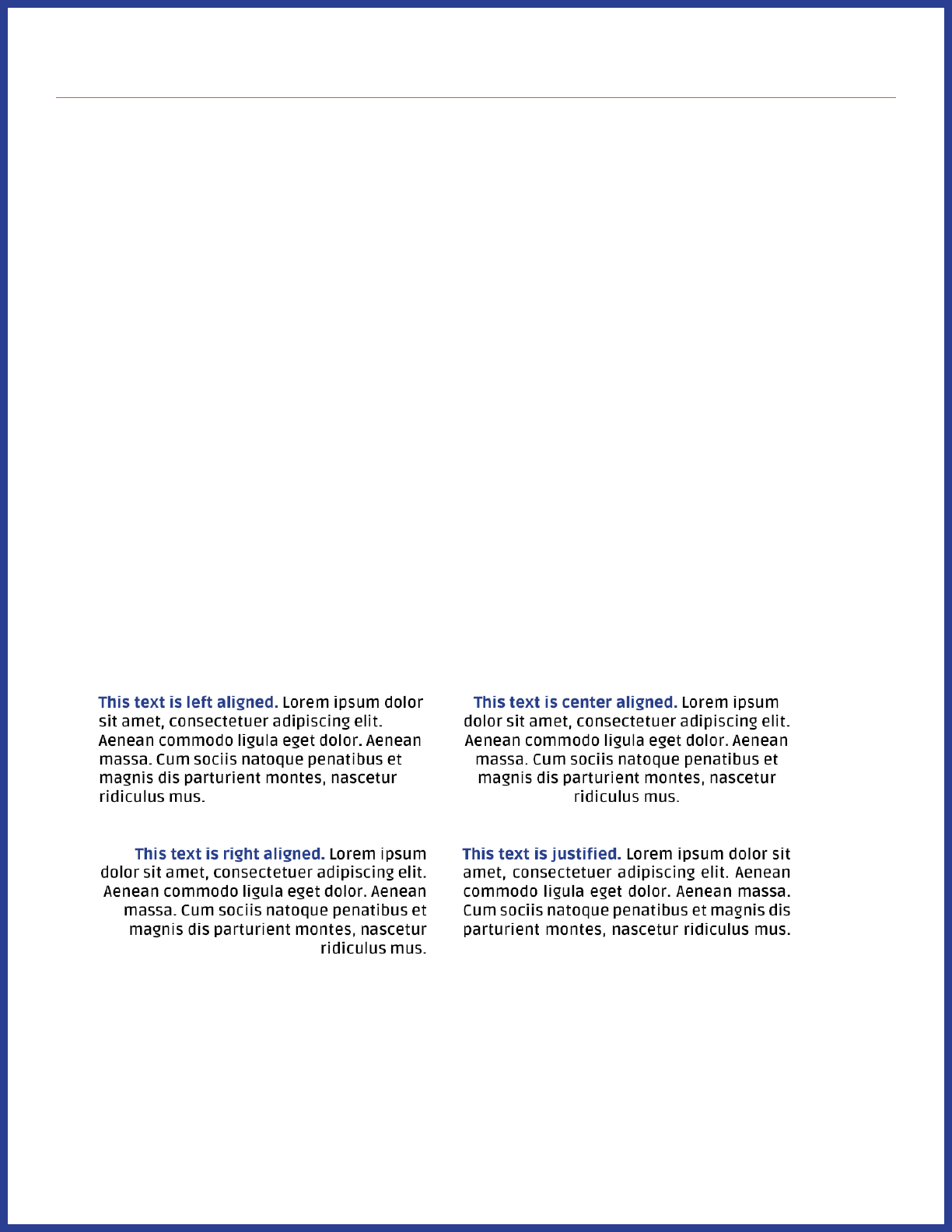
Basic text formatting
Left align text. Justied text creates visual gaps between words that
interrupt the normal pattern of text, making it more dicult to read.
Turn o hyphens. Breaking up words can pose diculties in
comprehension for some readers.
Similarly, avoid runts, widows, and orphans at all cost. These create
visual interruptions in the text that can break a reader’s focus.
Left aligning text
Text alignment refers to how text ows in relation to the rest of the
page. Left alignment lines text up along the left side of a page. Right
alignment lines text up along the right side of a page. Center alignment
lines text up in the middle of a page. Justied alignment lines up text
perfectly along the left and right sides.
43
Left-aligned text is the easiest to follow. The shapes created along the
right edge by diering word lengths help to distinguish lines from each
other, and the text follows the natural left-to-right reading order of
English and many other languages. While justied text might look the
neatest in the above example, it often produces strange gaps between
words:
These gaps can form “rivers” of white space which are distracting to the
reader.
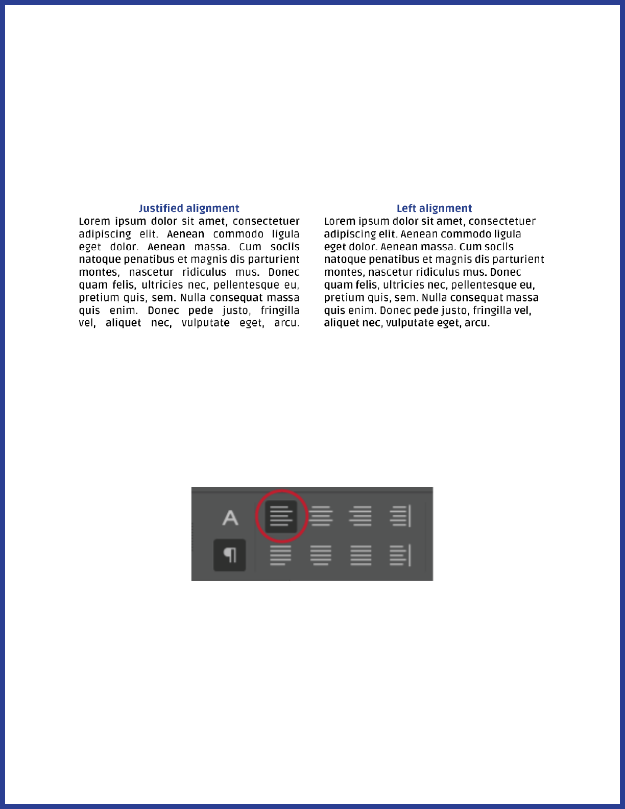
InDesign’s default setting is to left-align text. If for some reason your
text isn’t left-aligned, simply select some text, click on the Paragraph (¶)
button in the top toolbar, and then choose the rst alignment option.
44
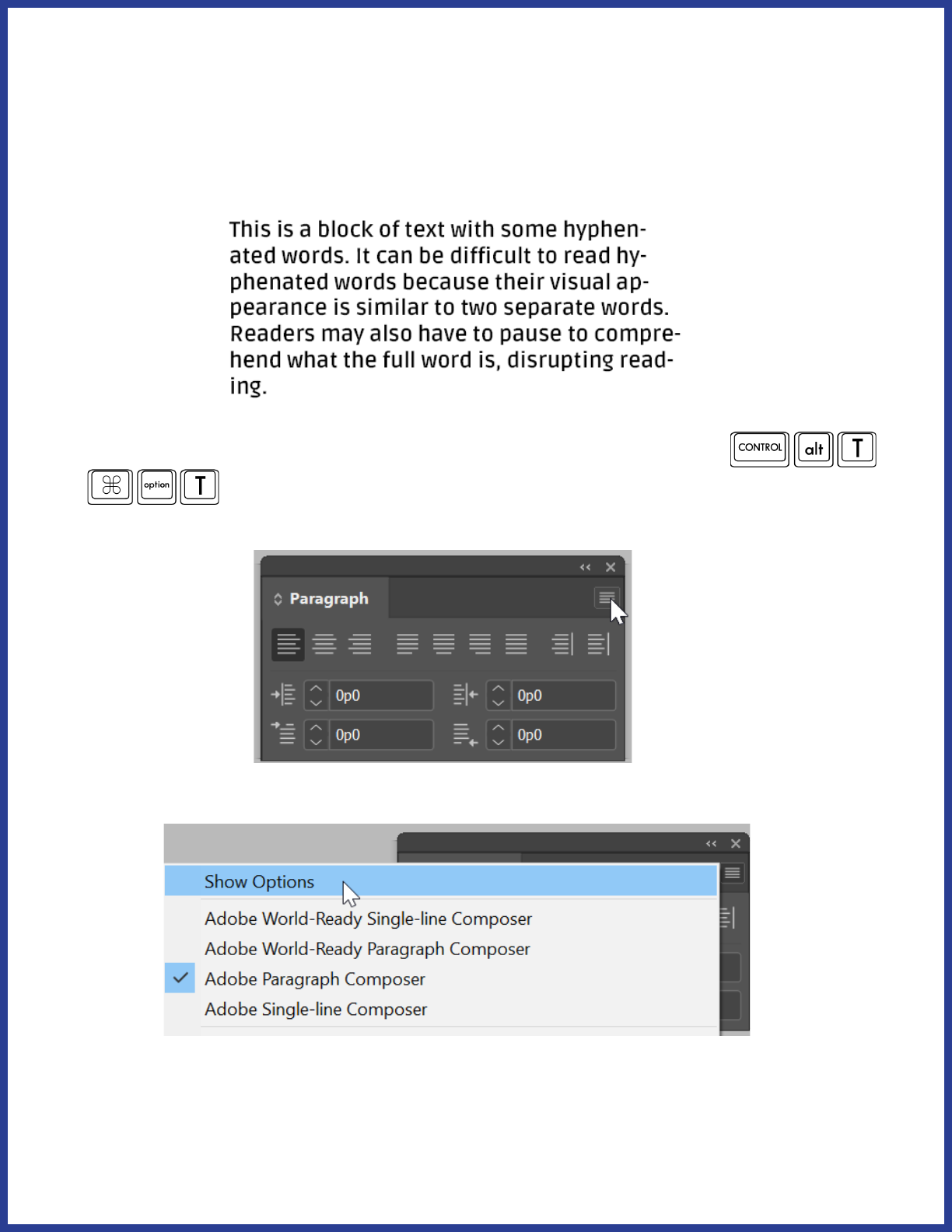
Turn off hyphenation
When words are broken across two lines, it disrupts the ow of text and
can hinder comprehension by the reader.
To turn o hyphenation in InDesign, rst press Ctrl+Alt+T (
or
) to bring up the Paragraph window. Next, click the three
lines in the upper right corner of the window.
Next, click “Show Options” on the menu that pops up.
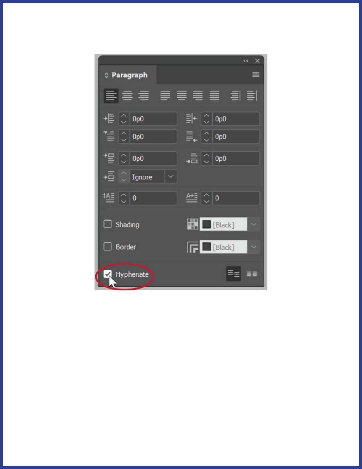
45
Select your text and then uncheck the Hyphenate checkbox at the
bottom of the options.
46
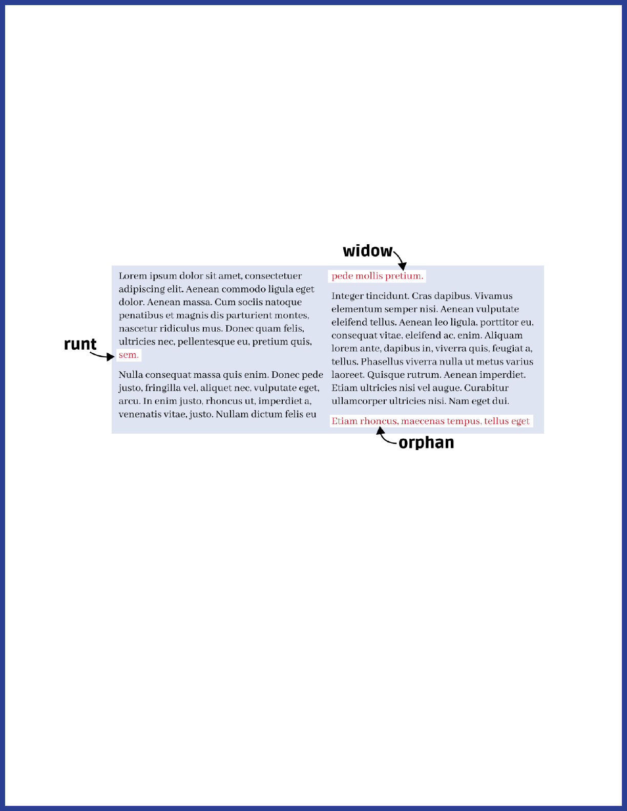
Runts, widows, and orphans
A runt is when the last line of a paragraph contains a single word.
A widow is when the last line of a paragraph doesn’t t on the page with
the rest of the paragraph and instead sits on top of the next page.
An orphan is when the rst line of a paragraph sits at the bottom of the
page by itself, separated from the rest of the paragraph.
Each of these three creates an interruption in the normal ow of
reading. Runts precede an unusually large chunk of white space not
usually found in text, which can break the reader’s focus by drawing
unnecessary attention to the nal word in a paragraph. Widows and
orphans each require that the reader hold a thought on one page and
continue it on the next, rather than reading the sentence all together.
For our purposes, we completely avoid ever splitting paragraphs or
sentences across pages. Let’s rst talk about how to get rid of widows
and orphans.
47
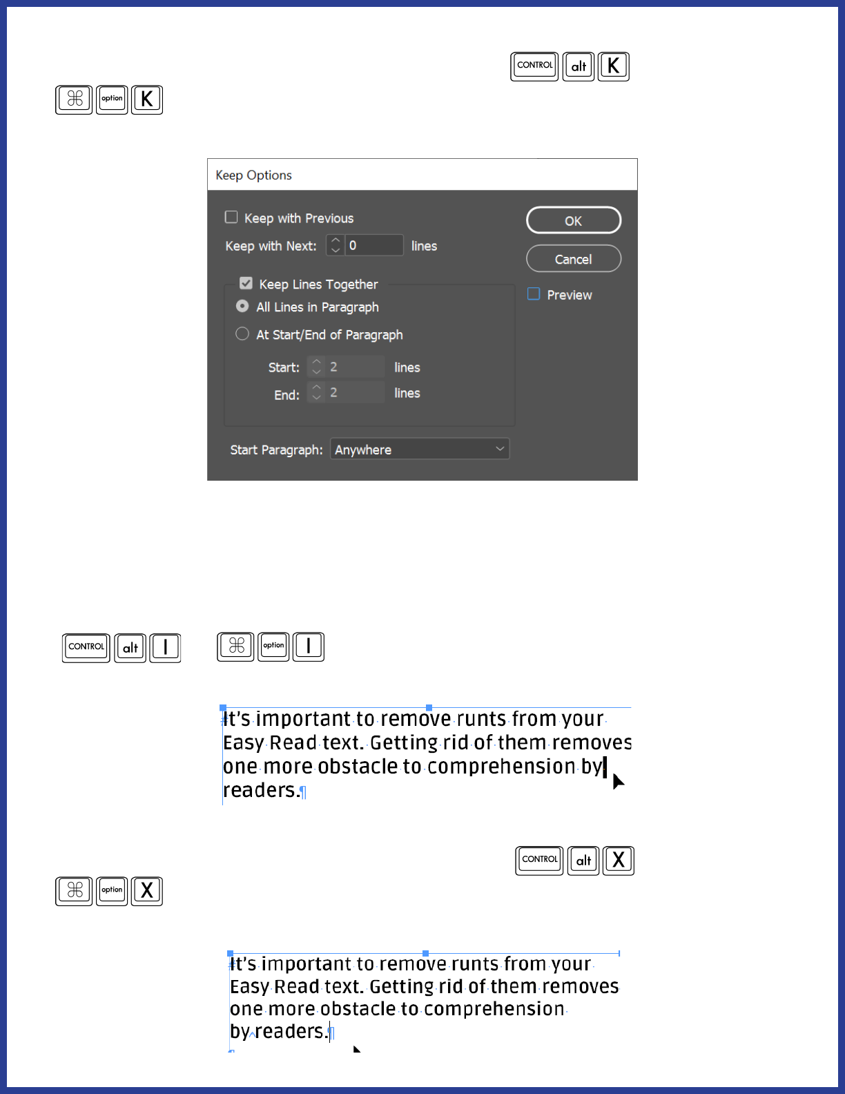
First, select your text. Next, press Ctrl+Alt+K (
or
) to bring up the Keep Options window. Click on “Keep Lines
Together” and “All Lines in Paragraph”. Click OK.
This takes care of both orphans and widows.
Dealing with runts is a little bit trickier. First, select the space before the
runt. You can turn on “Show Hidden Characters” by pressing Ctrl+Alt+I
(
or ) to make it easier to see where the spaces
are located.
With the space highlighted, press Ctrl+Alt+X (
or
) This will replace the normal space character with a non-
breaking space—that is, a space that keeps the words surrounding it
together:
48
You should do all of the text formatting before starting on clipart. One
of our house rules about clipart is that the same image cannot be used
twice on a page; you won’t be able to tell where you might need to use a
dierent image if you haven’t laid out the text yet.
Icons
Guidelines
Finding and creating eective Easy Read icons is a bit of an art form.
These guidelines come from trial-and-error and a lot of focus group
input.
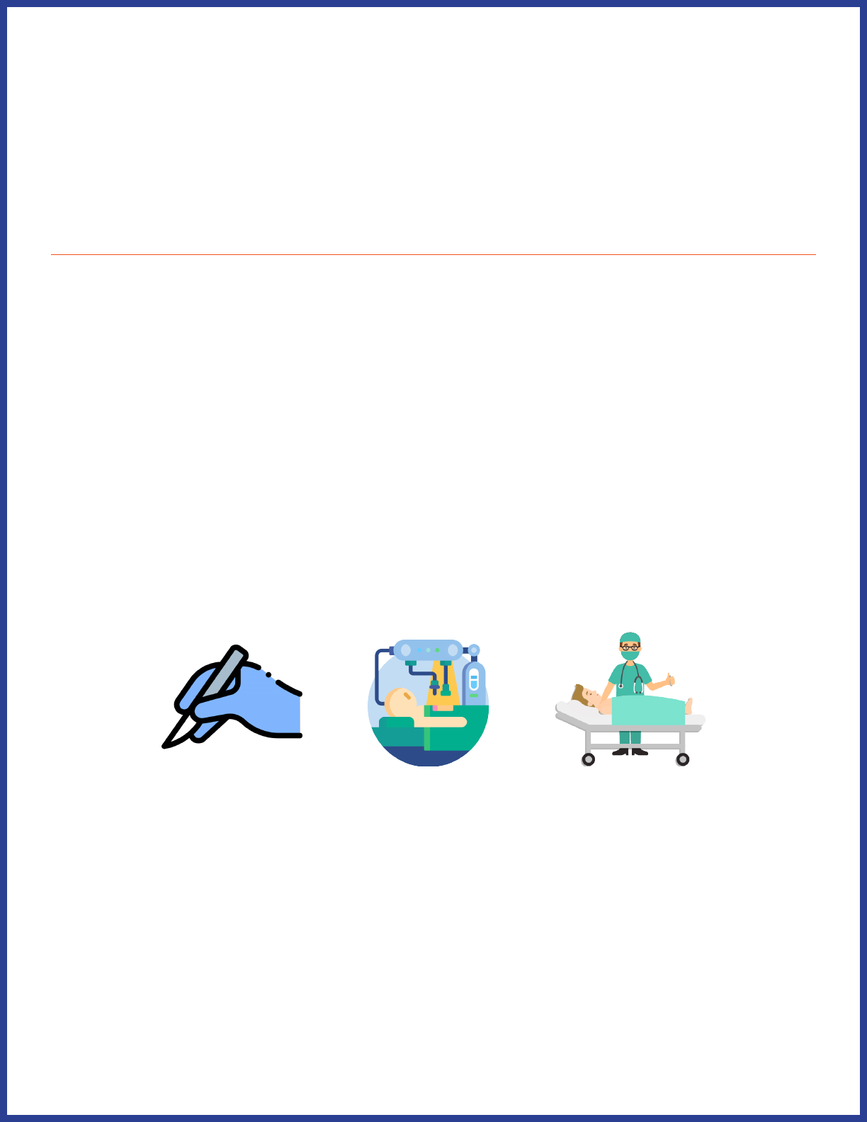
Icons’ meanings should be clear
This means an icon should have enough information to be understood
without too much extra added in. For example, here are some ways we
could represent “surgery”:
The rst one, a hand holding a scalpel, does not provide enough
information to be understood as “surgery”. It’s not clear whose hand
it is, and not everyone will recognize a scalpel. The object itself could
easily be a paintbrush or another utensil.
49
The second icon shows a complicated mechanical apparatus performing
surgery. There are a lot of details in this image that detract from the
meaning of “surgery” - typically, people don’t associate surgery with
robots, and the addition of the yellow light source in the background
doesn’t do anything but make the image more visually complicated.
The last icon is what we use to represent “surgery”. It’s clear that there is
a person laying down on a gurney, and a medical professional standing
next to them. We can tell it’s not a normal doctor’s appointment because
the medical professional is wearing a mask and the patient is asleep.
There’s no distracting background image detracting from the icon.
Art style shouldn’t be too stylized
There are a lot of dierent icon art styles. Some of them are not suited
to Easy Read. For example, look at these dierent ways of depicting an
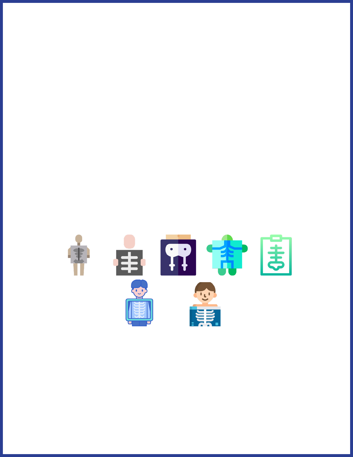
x-ray:
The rst ve icons are too stylized for Easy Read use. Their art styles are
simplied to the point of losing clarity. The bottom two icons are good
examples of art styles for showing an x-ray. It’s clear that something
is being held in front of a person allowing us to see their bones. The
people in the icons are calm, which conveys that the reason we can see
their bones is not due to some horrible trauma.
50
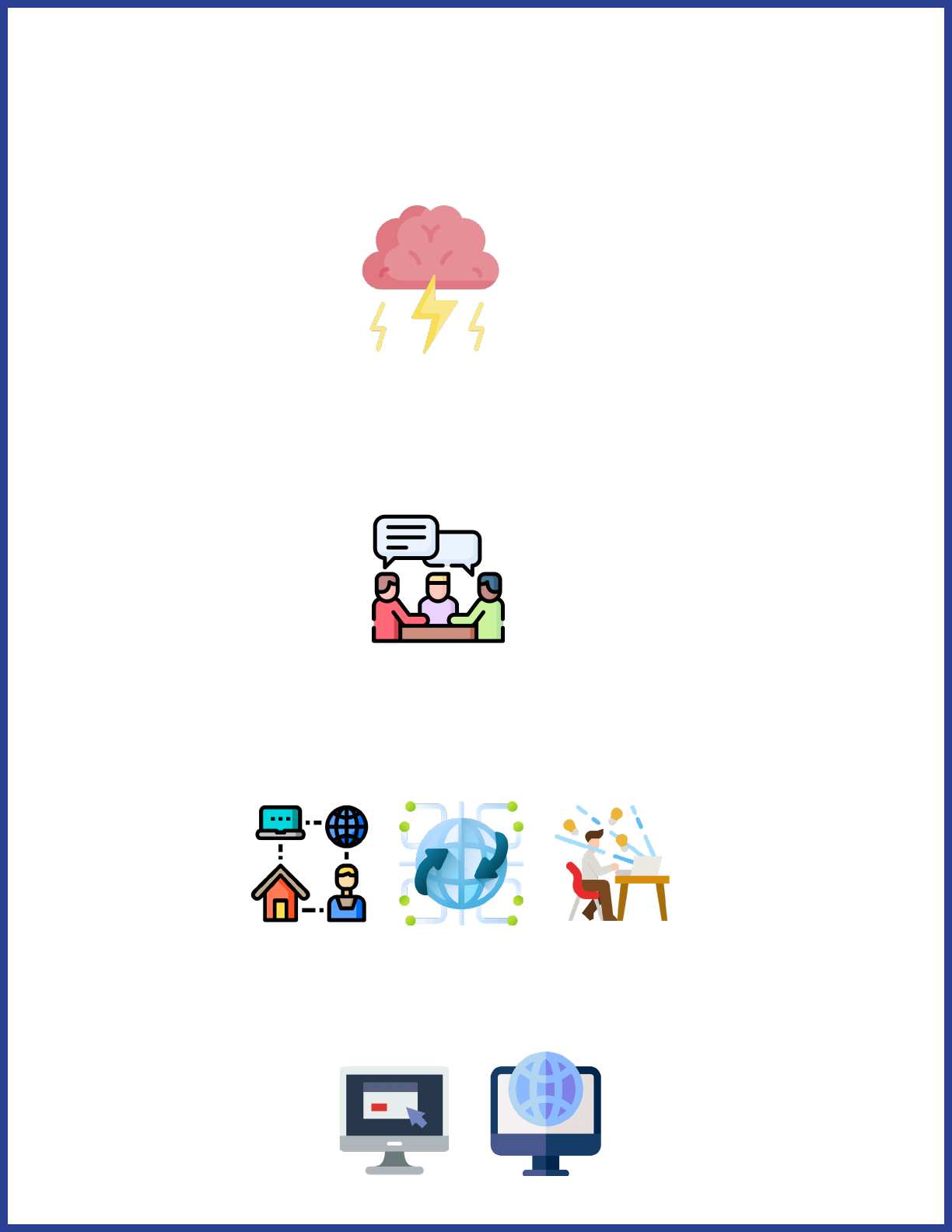
Avoid metaphors when possible
You’ll often nd dierent clever ways to represent concepts. For
example, you might nd this image for “brainstorm”:
While it does represent the word “brainstorm”, it doesn’t really represent
the concept “brainstorm”. The image may confuse readers rather than
clarify the concept. Instead, you could use something like this:
This image shows people having a discussion, which is what
“brainstorming” actually looks like. Or how about these icons, which are
all meant to represent the Internet:
These images all depict the internet in abstract ways. Instead, think
about what the internet actually “looks like” to most people: a computer
used to go online. These icons would work better:
51
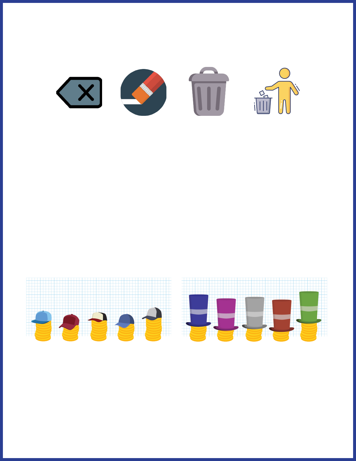
When you do have to represent abstract ideas, try to limit your
illustrations to simple, commonly used symbols. For example, here are
four ways you could represent “getting rid of something”:
The rst icon is a mobile phone symbol for delete. It isn’t a widely-used
symbol that would be easily recognizable. An eraser could be associated
with “getting rid of something”, but it has a stronger connotation of
“mistake”. A trash can on its own gets closer, but it doesn’t actually show
“getting rid of something.” The fourth icon is what we would use. We’re
familiar with this symbol from its use on actual trash cans, and it shows
the action that the plain trash can icon abstractly represents.
There are some exceptions!
For example, take a look at these two images that represent “caps on
spending” and “raising the cap”:
Here, the hats symbolize the more abstract concept of a “cap” on
spending. It’s not too metaphorical in and of itself, however - the grid
lines behind the images make it easier to see that the caps are, in fact,
raised. The key is to ask, “Does this metaphorical image help clarify the
literal meaning of an idea?” In this case, the hats show that there is a
limit to the spending and that the limit can be raised.
52
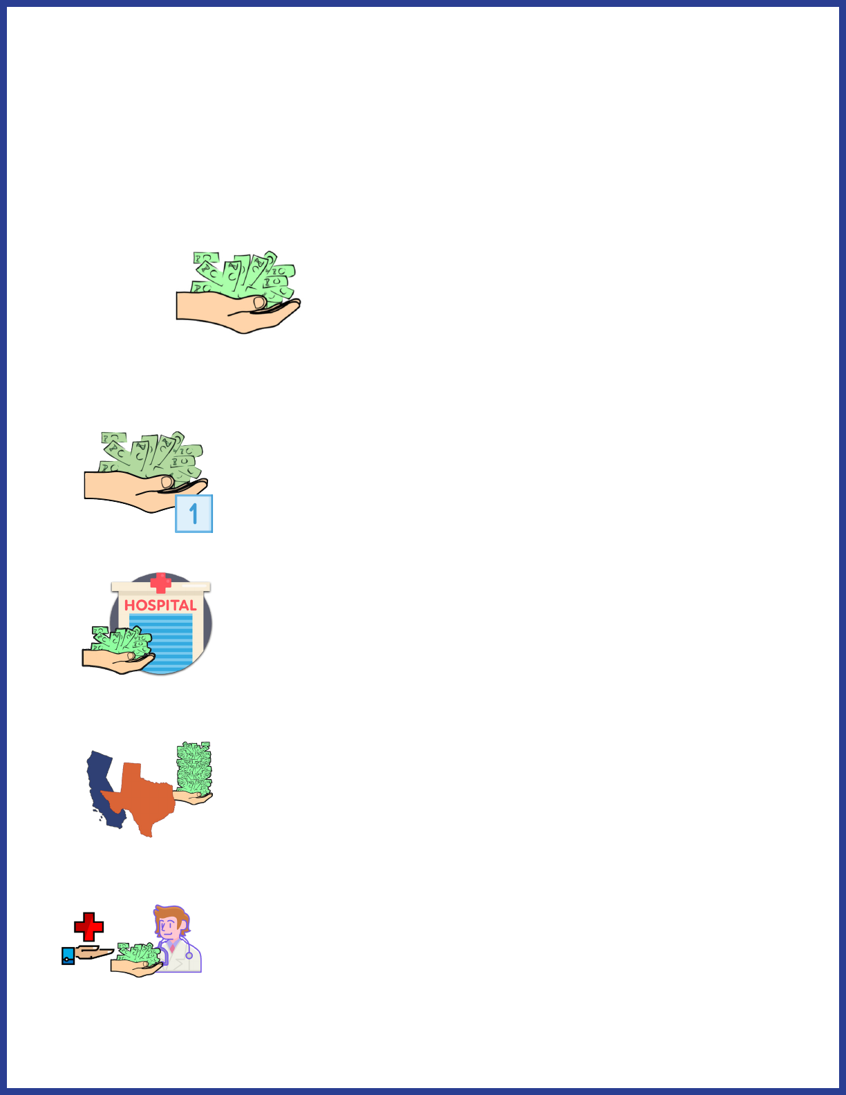
Build upon previously used icons to create new concepts
You don’t have to come up with a new image for every single concept. In
fact, it’s often better if you don’t! You can use repetition to build upon a
concept you previously established. For example, we use this icon to
represent “pay for something”:
Here are some concepts using “pay for something”:
pays one time
pays for hospital visit
states pay a lot
Medicaid pays the doctor

53
In the last image, you’ll notice a pattern: both the icon for “Medicaid” and
“pays for” use an outstretched hand. This is another example of building
on a previously-established concept. In this case, the outstretched hand
represents “giving something”. For Medicaid, it’s the government giving
healthcare. For “pays for”, it’s something giving money to something
else. By repeating the same images, you can reinforce their meaning
throughout the Easy Read document, creating easy shorthand ways to
represent certain ideas.
House Rules
We have developed some specic rules about our own icon usage. You
don’t necessarily have to follow these.
We don’t illustrate the sentence that leads into a bulleted list. This rule
is more for saving space than anything else - we nd that oftentimes,
adding an image to the rst sentence would make it so that a full list
wouldn’t all t on one page.
We don’t use the same icon twice on the same page. Using an original
icon and then an icon that incorporates the original one on the same
page is okay. We do this because icons, for some readers, help “anchor”
the text in their minds, and repetition of the exact same icon next to
multiple paragraphs can cause some confusion.
We don’t use shields (on their own) or cops to represent “safety.”
This rule followed discussions with focus groups, who indicated that
for many people, cops don’t represent protection as much as they
represent aggression and combat, and shields can often be mistaken for
police badges. However, we have found success in using a knight with a
shield to represent safety/protection; this works better because nobody
has had real life experience with knights.

54
Icons should be diverse - like your readership! We’re careful to make
sure our icons aren’t only depicting white men. Easy Read documents
are created to include more people in the dissemination of information,
so visual elements should be inclusive as well. This often means editing
existing icons when pre-made inclusive ones can’t be found.
Do I have to make them all myself?
Absolutely not! Here are some of the websites we use to source icons:
• Adobe Stock
• Flaticon
• Vecteezy
• Clker
• Freepik
• Envato Elements
• Human Pictogram 2.0
The Icon Process
Identify central concept
First, we go through each paragraph and identify the central concept.
We usually organize these in a spreadsheet. Central concepts are a few
words describing the most important takeaway from a paragraph that
can be represented in an image. It will take some practice to get good at
this. Here are a few examples.
Sometimes the President and Congress disagree on what is important.
55
The central concept here is “disagreement”.
Congress is supposed to pass the budget by April 15. It usually takes
longer than that.
The central concept here could be “by April 15.” But that would gloss
over the fact that it usually takes longer. So the central concept here is
“takes longer,” or, even better, “takes a long time.”
When writing central concepts, keep in mind that these are the concepts
you’ll have to illustrate. “Takes a long time” is easier to illustrate than
“takes longer.” In order to show “longer”, you have to also depict what
it’s longer than. Then, you have to show that one thing has “more time”
and another has “less time.” If your concept is “takes a long time”, all you
have to illustrate is “long time.” Simpler central concepts lead to easier,
less abstract, and clearer illustrations.
Identify repeated concepts
When you’re identifying central concepts, you’ll most likely nd that
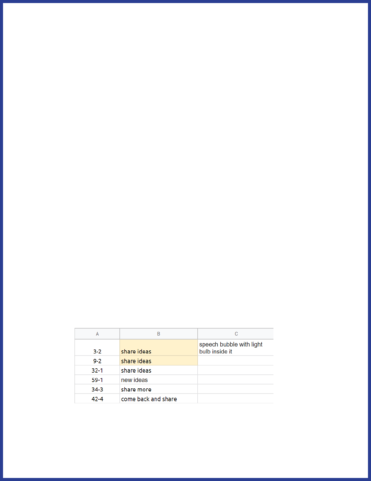
certain concepts are repeated. Here’s an example from one of our
planning spreadsheets. Column A shows what page and what paragraph
on that page the concept is referring to.
Since we had identied multiple spots where the central concept was
more or less “share ideas”, we made a note that all of those images
could be the same.
56
This serves two purposes: 1) When you’re looking at hundreds of
paragraphs that need icons next to them, it’s important to gure out
how you can reduce the number of separate images you’ll need to nd/
make and 2) Like we said before, re-using images for the same concept
can help reinforce their meaning throughout the document.
Decide on visual representations
Once you’ve got a list of all your central concepts (including the repeated
ones), you’ll need to start deciding what images you’ll use to represent
each of them. Here are some examples from our planning spreadsheet:
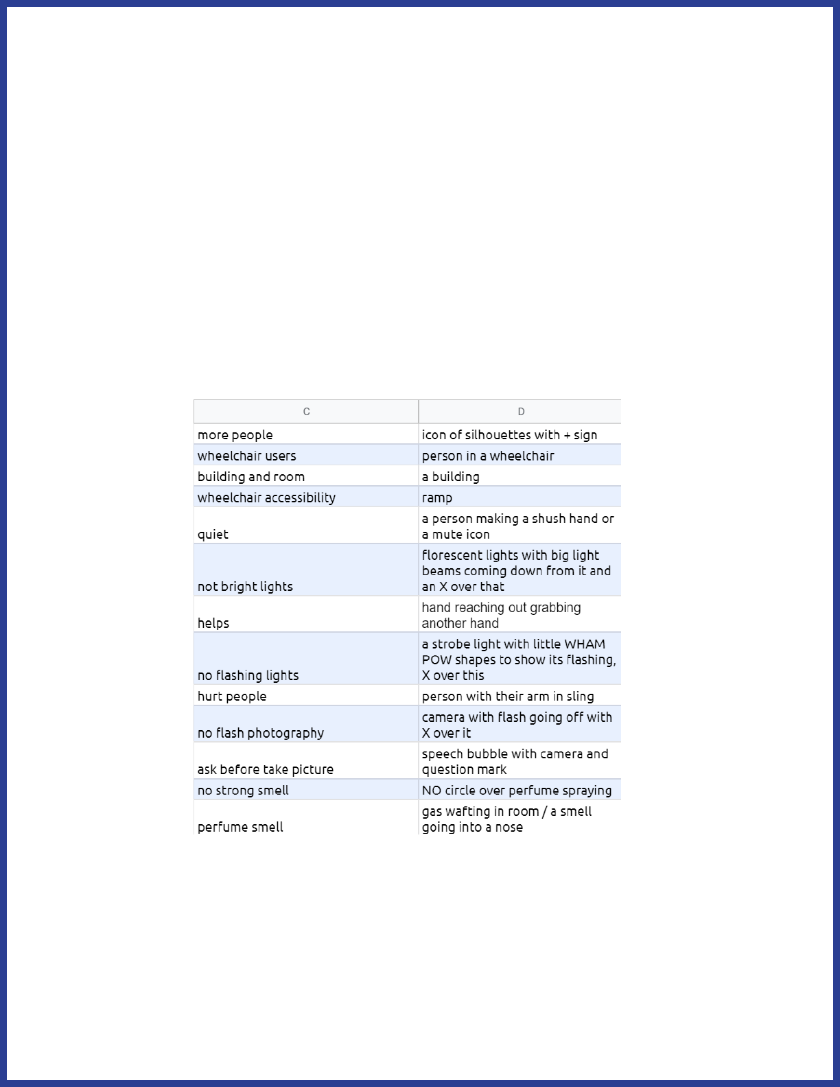
The left column has the central concepts we identied. The right column
has our ideas for how to visually represent those concepts. Some of
them will be simple: for “wheelchair accessibility”, we decided we would
use a ramp icon. Some of them will be more complex, and may require
you to combine dierent icons or create entirely new ones.
57
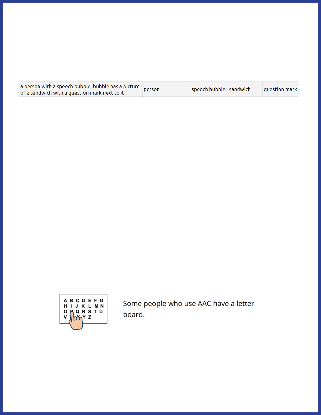
Figure out what edits you need to make
Sometimes you’ll need an image with multiple components. Here’s an
example from our planning document. The visual representation is on
the left, and the individual components are listed on the right.
While some of the paragraphs will have simple icons, this paragraph
requires that we combine a few dierent icons together into one new
image.
Sometimes, you’ll need to make edits to an icon itself. For example,
taking a pre-existing clipart image of a person and changing their facial
expression or what they’re doing with their arms. You should keep track
of these kinds of edits, too. It’ll help you to estimate how long your Easy
Read project will take overall.
Figure out what images you’ll need to make yourself
Sometimes your search for a specic icon won’t turn up much. In those
cases, you may need to make a new image. For example, we had to
create a new icon for “letter board”:
The hand icon was a pre-existing image we just combined with our letter
board icon.
58
Find and make the icons
We recommend saving each image with a lename that will help you
nd it later. If it’s only used once, we name our icons after the page they
appear on and which paragraph they’re in on the page. For example,
“45-2.jpg”. If they’re icons for a repeated term, you can use the name of
the concept they’re depicting. For example, “share ideas.png”
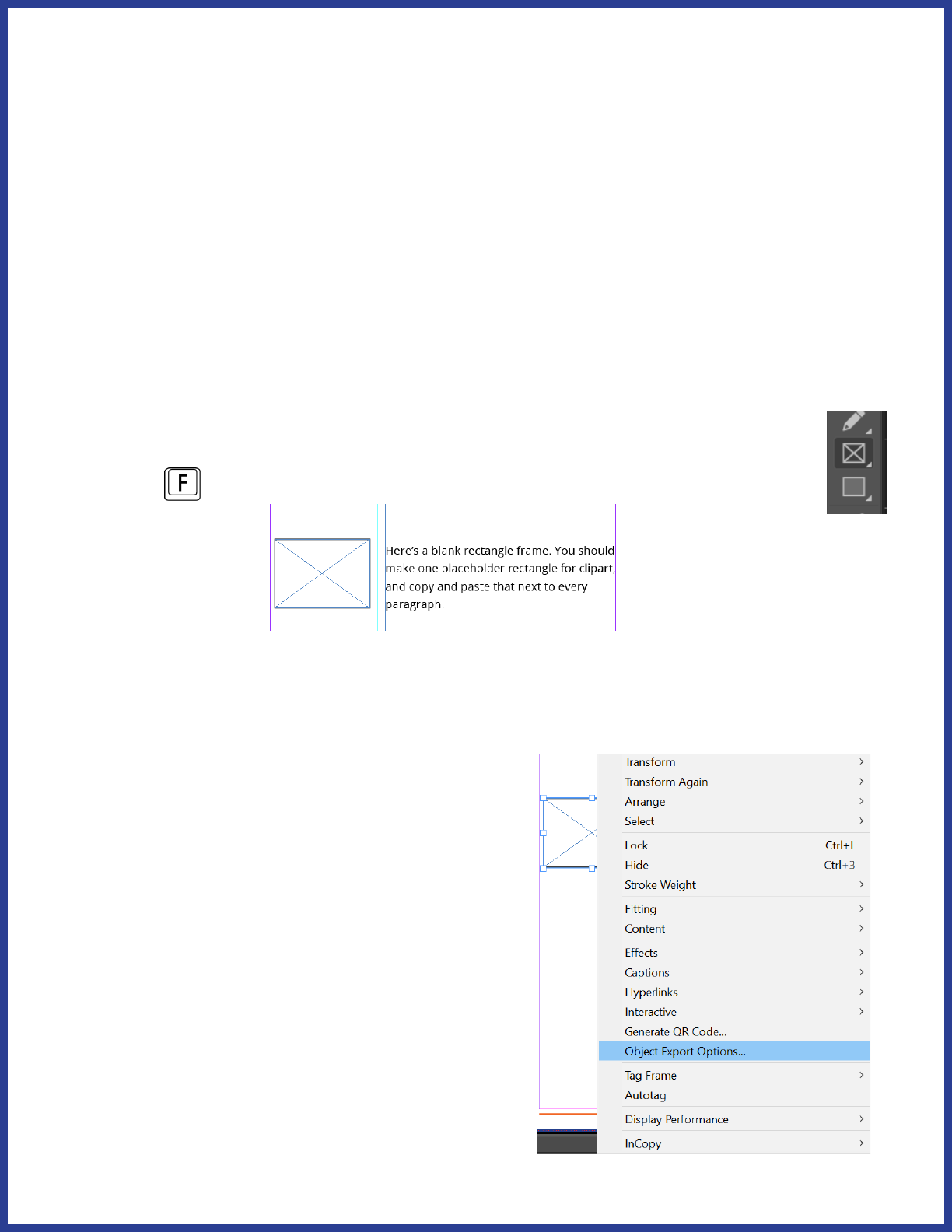
Placing icons
First, you want to add a placeholder frame for the icons next to
every paragraph. Start by clicking on the Rectangle Frame button
(or press
). Create one frame.
You’re going to be copy-and-pasting this frame next to every paragraph.
But rst, we have to tweak some settings on the frame.
Right-click on the frame and choose
“Object export options”.
59
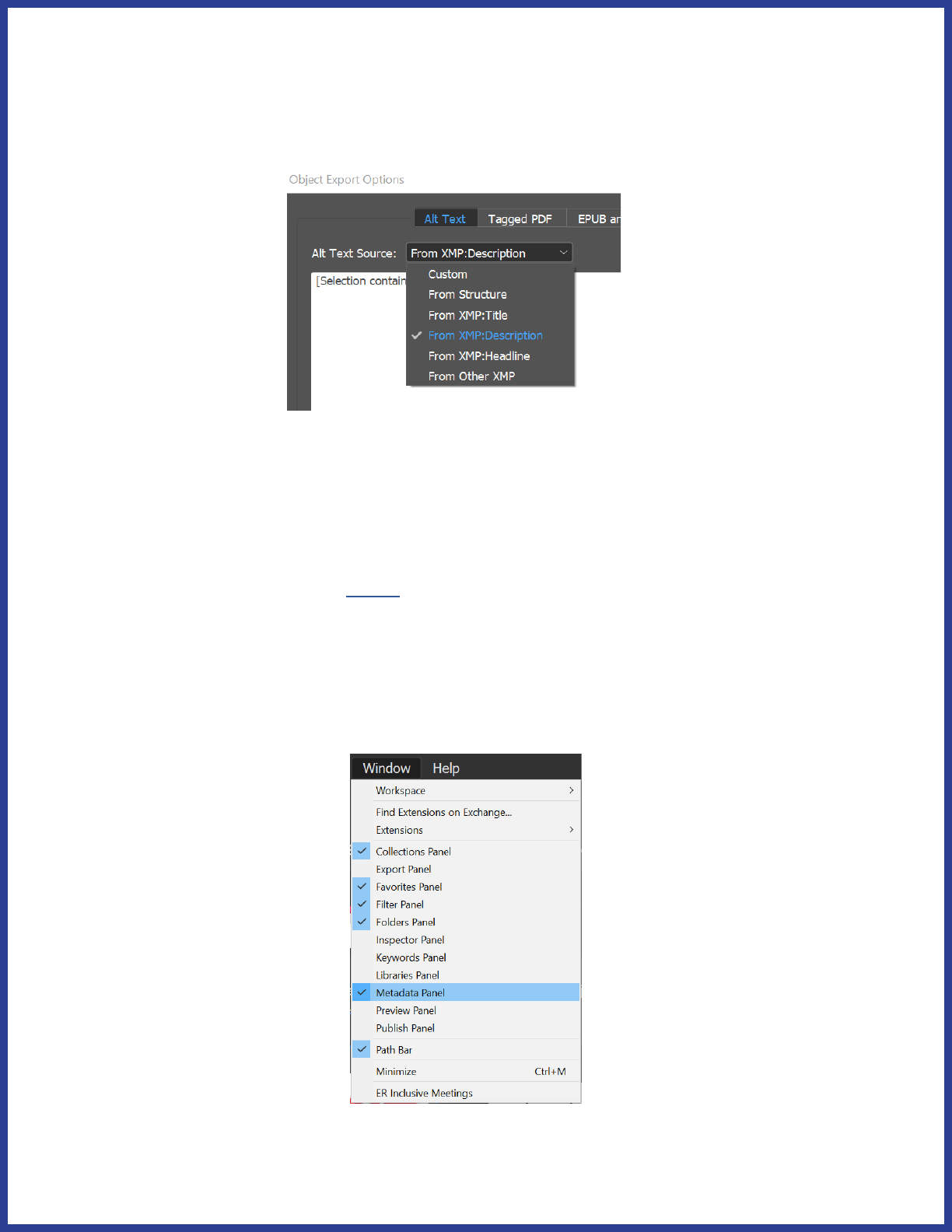
A box will pop up. Change “Alt Text Source:” to “From XMP:Description.”
We’ll explain what this means in the next section. For now, click “Done”
and then copy-and-paste the frame next to every paragraph.
Adding alt text
We use Adobe Bridge to add alt text to our icons. You can nd basic
tutorials on using Bridge here, so we’ll just cover what you need to know
to add alt text. First, make sure that the Metadata panel is visible. You
can toggle dierent panels on or o by clicking “Window” on the top bar
and then clicking on each panel. If the Folders Panel isn’t visible, toggle
that one on as well.
60
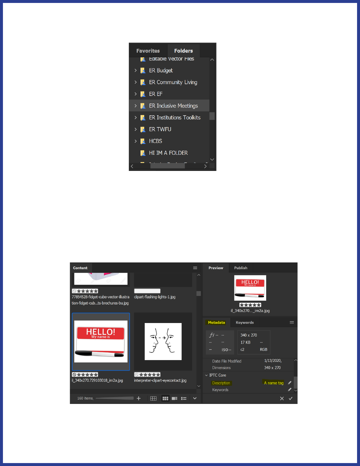
In the Folders Panel, you can navigate to the folder that contains your
clipart.
Once you’ve found the folder, click on one of your images. Then, scroll
down in the Metadata panel until you see the section called IPTC
Core - Description. Click on the little pencil icon to the right of the
Description eld. This is where you enter in your alt text for that image.
Remember how we set the Object Export Options to nd alt text from
“XMP:Description”? This description eld is what it’s referencing.
61
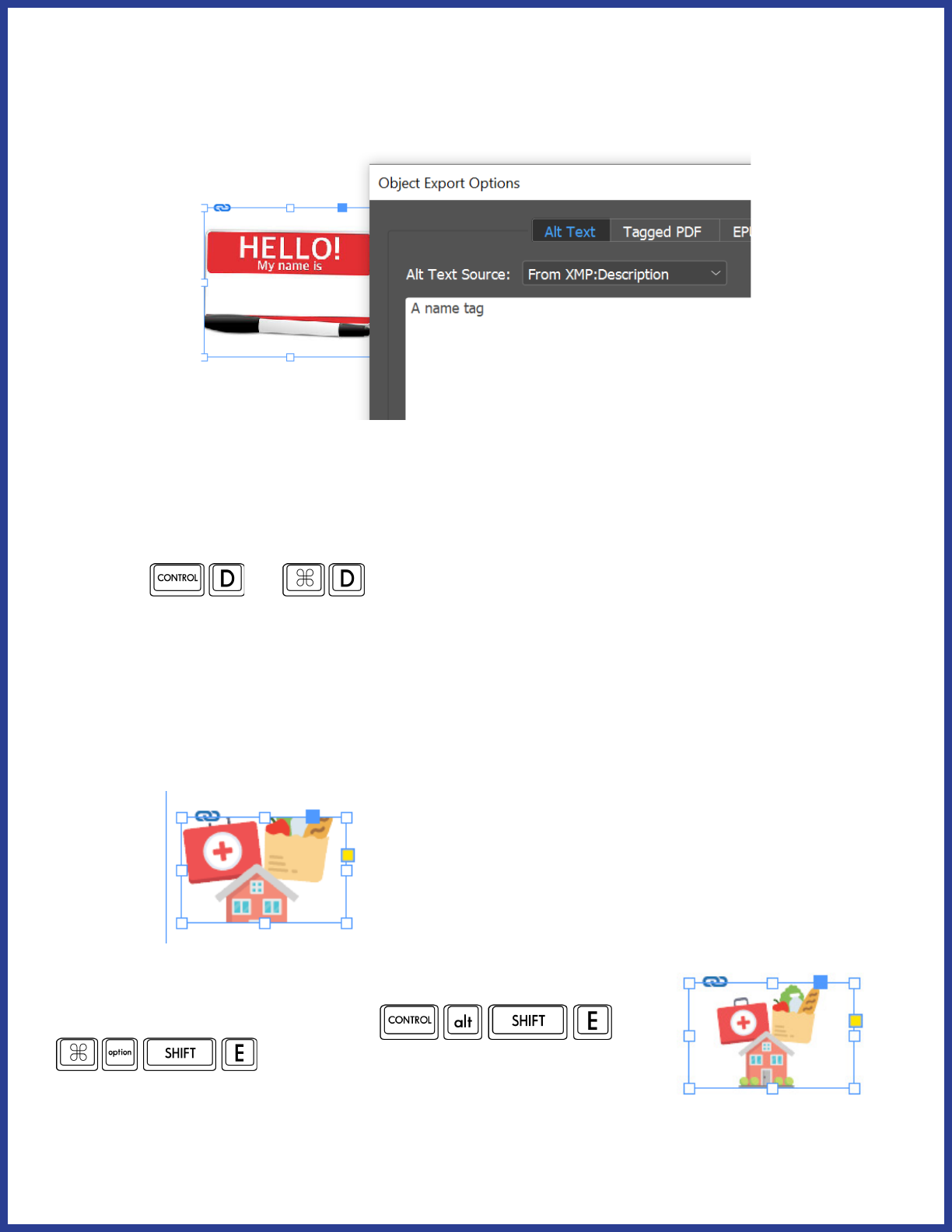
Now, if you drag in your clipart from Bridge, it’ll automatically assign the
alt text you entered.
You can drag clipart from Adobe Bridge straight into one of the empty
rectangles you created.
You can also add images by clicking on the empty frame and pressing
Ctrl+D (
or ) and then selecting the image you want to
place in the frame.
Fit content to frame
Sometimes when you drag in an image, it might be cut o at the edges
like this:
There’s an easy way to x that! Select the frame and
then press Ctrl+Alt+Shift+E (
or
). This will resize the image to t
perfectly in the frame.
62
Saving time with styles
Easy Read formatting can be really time intensive! One way you can
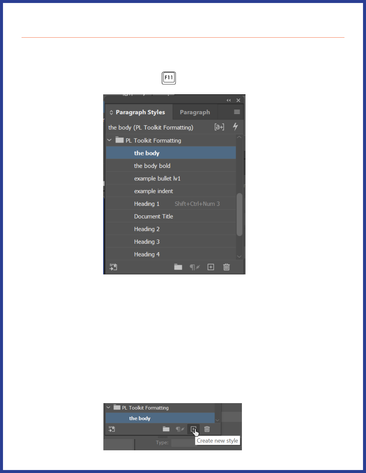
speed up the process is by saving Styles. First, open up the Paragraph
Styles window by pressing F11 (
)
As you can see, my Paragraph Styles window contains the styles I’ve
used to format the document you’re currently reading. The benet to
this is I can save the styles to a library, or import it to a document later.
Next, select some of your text that’s in a style you want to save. For
example, one of your headers.
Next, go over to to your Paragraph Styles window and click on the +
symbol at the bottom:
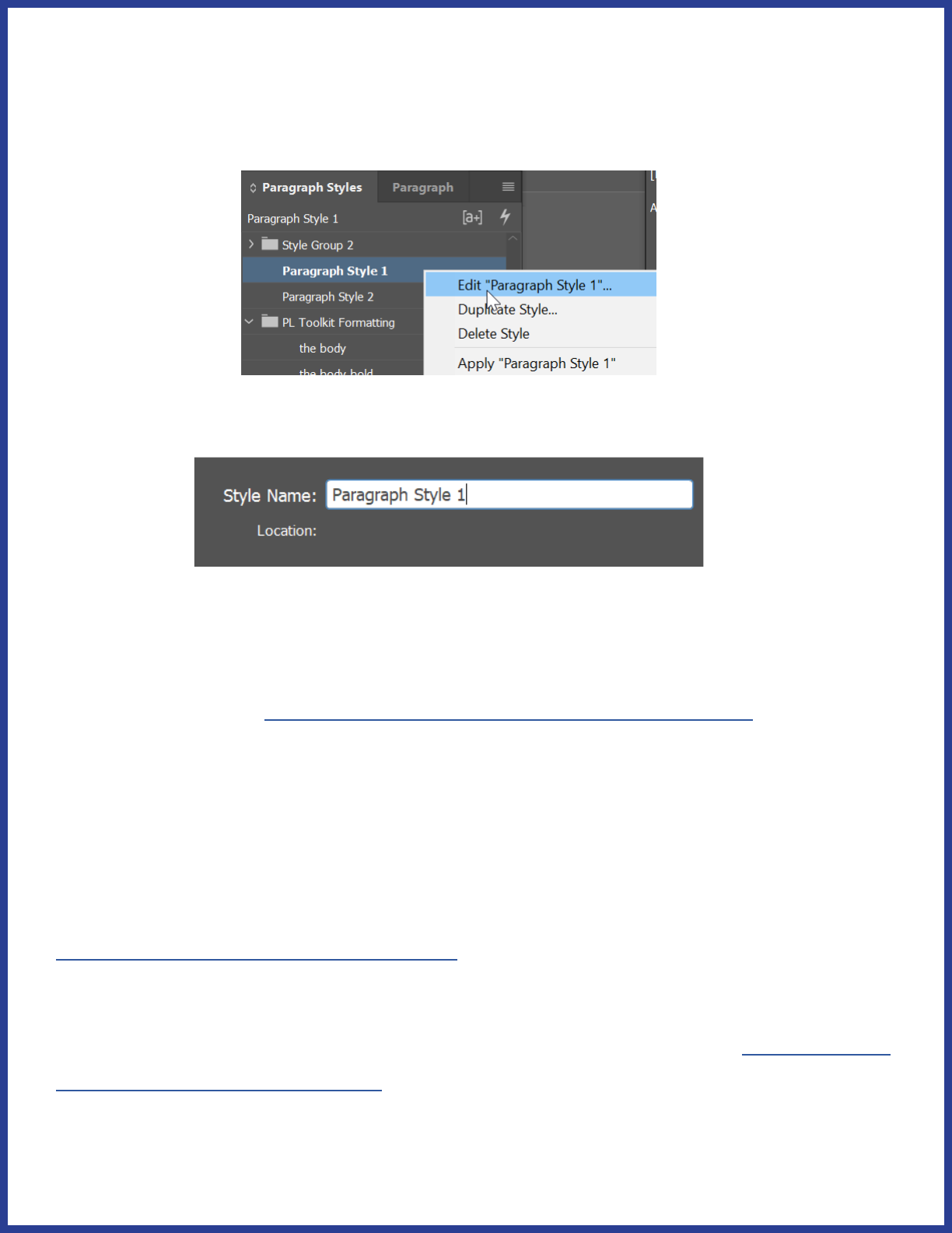
63
It will add a style to the list called “Paragraph Style 1” or something
similar. To rename it, you can either slowly double-click on the name or
right-click and select “Edit ‘Paragraph 1’”.
Then, you can change the name of the Style at the top.
Now, when you select some text, you can quickly apply the Style you set
to that text.
Read more about using character and paragraph styles here.
ASAN’s Style Library
ASAN has also put together an Easy Read Formatting Style Library that
you can use as the basis for your own projects, changing the fonts and
colors to suit your own organizational brand or preferences. You can
access this library on the web here, where you can copy it to your own
Adobe libraries.
You can also import the library straight into InDesign. First, visit this link
to download the Library le.
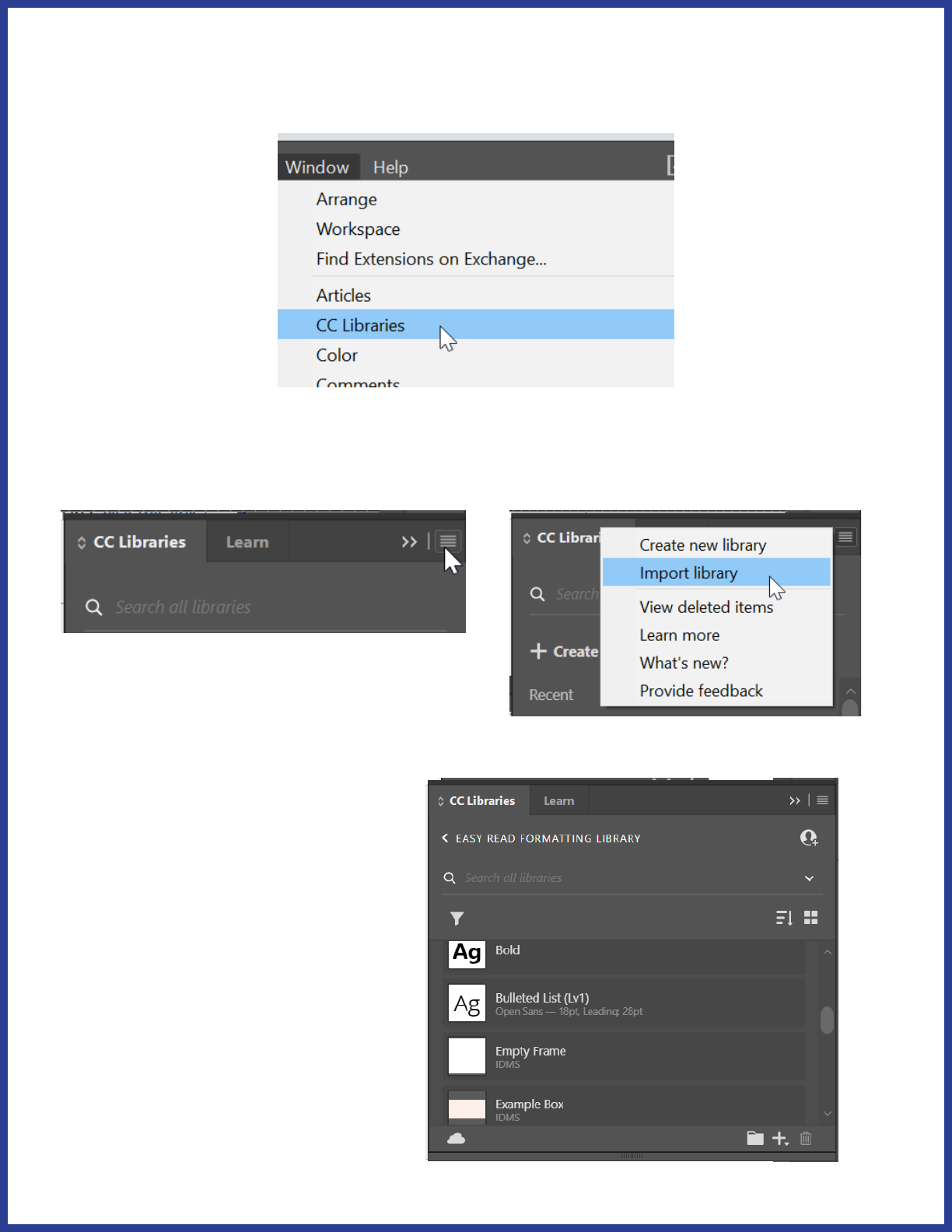
64
Next, open the CC Libraries panel by clicking on Window > CC Libraries
in the top menu of InDesign:
Click on the three horizontal lines in the upper right corner of the CC
Libraries panel and then select “Import library”:
Click on “Select library” to nd the .CCLIBS le you just downloaded
and then click “Import.” You
should now be able to access
our Easy Read Formatting
Library from inside InDesign.

65
The library contains Character and Paragraph Styles as well as Objects
you can drag in. Some of the Objects are templates for dierent pages,
including Master Pages. You can learn more about using Master Pages
here.
To learn more:
What Is Easy Read? - Photosymbols
A guide to making Easy Read information - from the Oce of Disability
Issues in New Zealand
Choosing an Accessible Font - Recite Me
Get Started with InDesign - Adobe Help Center
Adobe Bridge User Guide - Adobe Help Center
About character and paragraph styles - Adobe Help Center
Create book les with Adobe InDesign - Adobe Help Center
